Selected Work / Web to Print
Web to Print
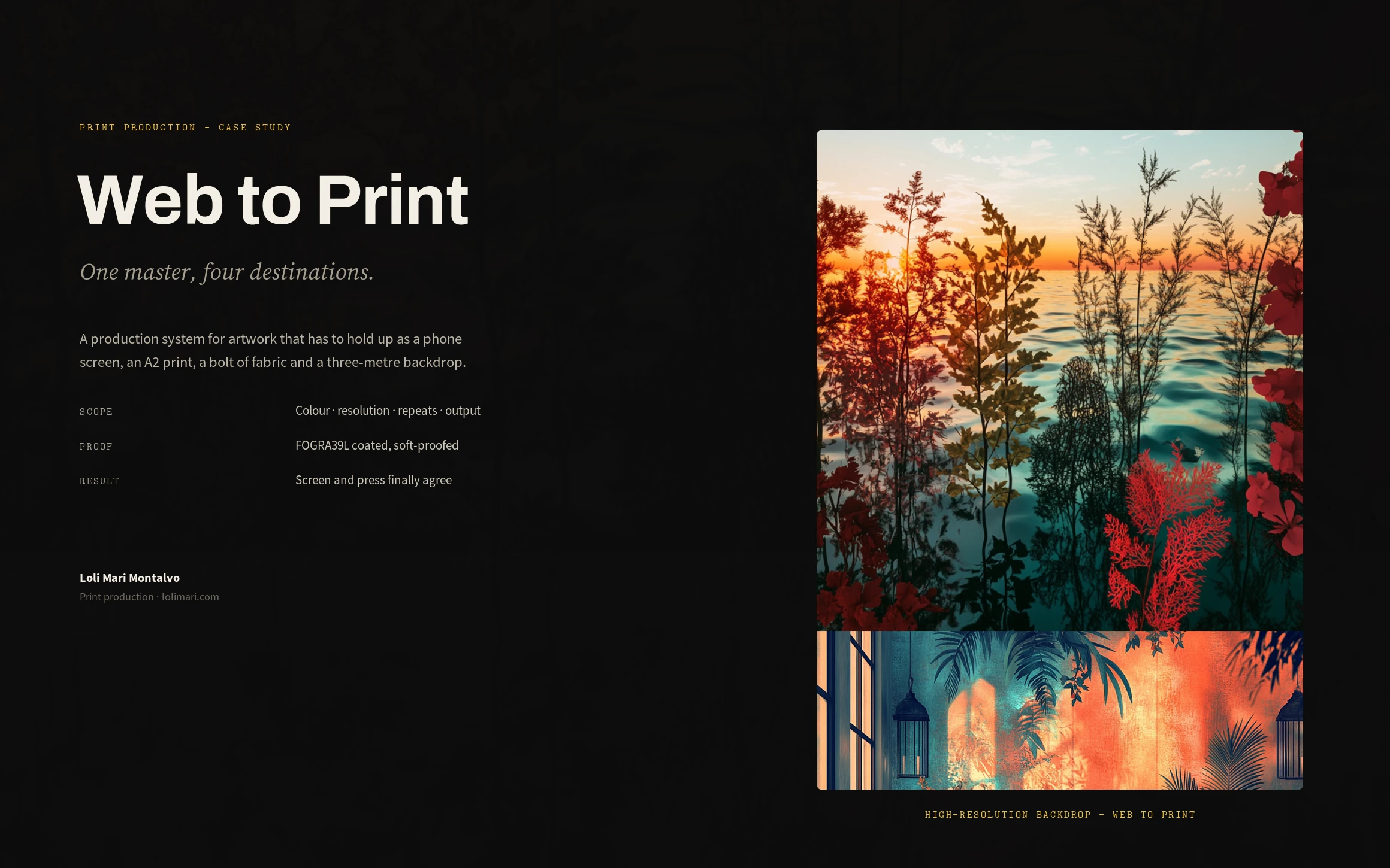
A production system for artwork that holds up as a phone screen, an A2 print, a bolt of fabric and a three-metre backdrop.
fineartsloli · high-resolution backdrops, textiles & prints · Print production · 2026
Role
Print Production & Colour Management
Scope
Colour, resolution, repeats, output
Outcome
Repeats that reached fabric — skirts and trousers, no seam anywhere
Overview
This is the production system behind my own web-to-print line — high-resolution backdrops, seamless textiles, merch and framed art prints. The artwork is mine; the case study is about what has to happen to it before any of it can be manufactured.
The challenge
The same artwork ships as a phone wallpaper, an A2 art print, a seamless textile and a three-metre studio backdrop. Each of those destinations asks something different of it — the coated gamut, real viewing distance, an invisible tile, a file anyone can identify at a glance. Exporting from a finished file and hoping is how you get a reprint bill; designing against all four from the start is how you don't.
My strategic thinking
I stopped treating print as an export step and started treating it as a design constraint. One master, four destinations — and the master is proofed against all four demands before any of them ships. If one destination asks for more, the master changes, not the export. The deliverable stops being a file and becomes a pipeline.
Process
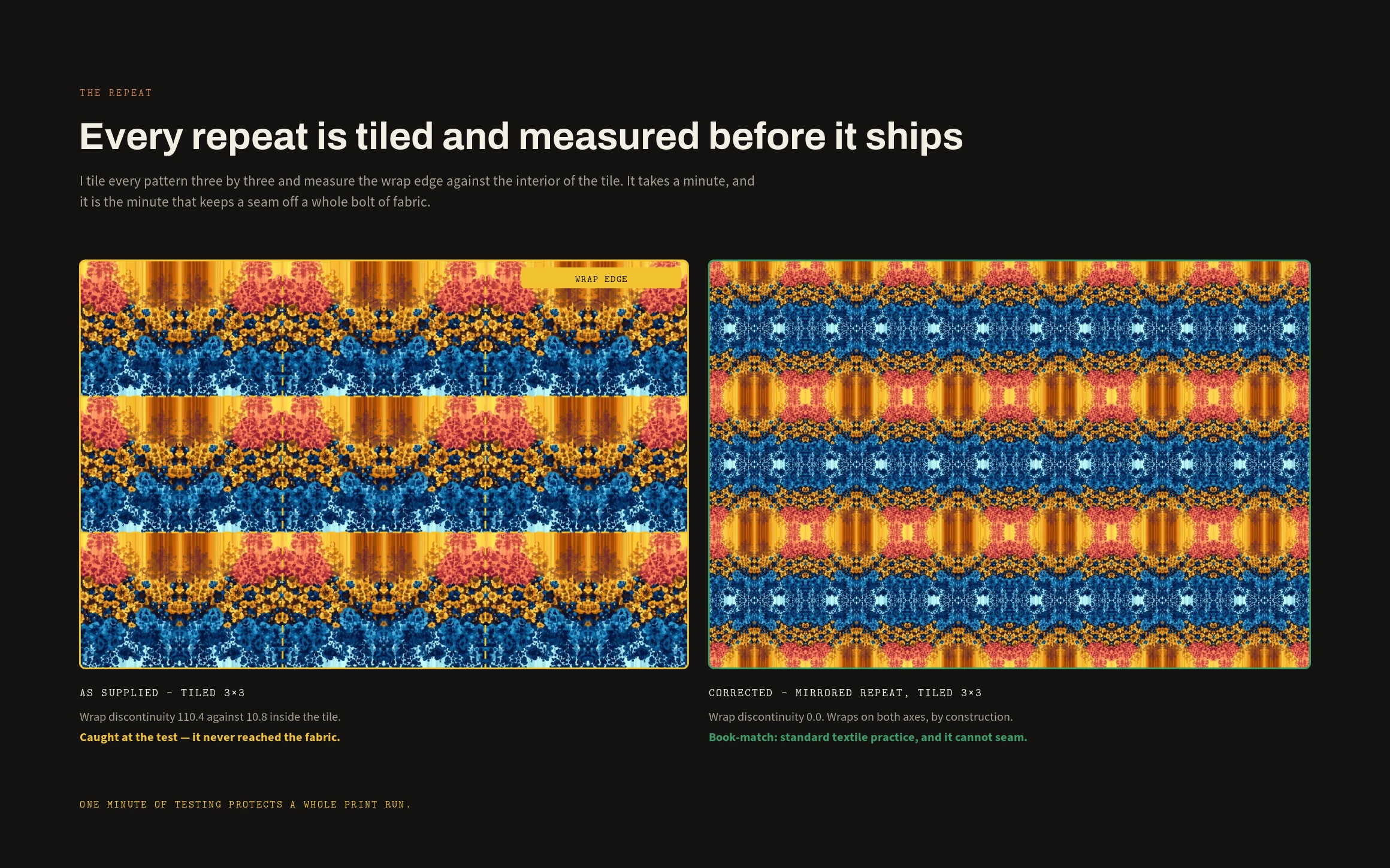
Every piece goes through three tests. A colour test: soft-proof against FOGRA39L coated and see exactly what the press can hold. A resolution test: work out the actual viewing distance and size the file to that, not to a superstition. A repeat test: tile it three by three and measure the wrap edge against the interior before it goes anywhere near fabric.
What the tests found
Colour: every piece gets soft-proofed. On the blue-and-gold pattern 11% of the palette reached past what coated stock can hold; on the crimson one, 21% — and the shifts are exactly where you would expect, the deep blues (ΔRGB 57) and the vivid reds (ΔRGB 61), because neither a true fire-engine red nor a saturated deep blue exists in coated CMYK. So I build the palette from colours that live in both spaces and only then paint: it costs a little glow on screen, and it buys a press that never surprises you. Resolution: 300 dpi is a habit, not a rule — a backdrop read at three metres needs 150, which is exactly why the file is named 3000x2000_RGB_150. The spec lives in the filename so nobody has to open it to know what it is. Repeats: every tile gets measured before it ships. One pattern came in with a wrap discontinuity of 110.4 against 10.8 inside the tile — caught at the test, long before fabric. Rebuilt as a mirrored book-match repeat it measures 0.0, and cannot seam.
The final solution
Four products off one master — a 3000×2000 backdrop, a mirrored textile repeat, badge art for merch, and a framed 300 dpi edition — each proofed, re-gamuted and repeat-tested before it shipped. The repeats went on to be printed as cloth and cut into garments: pleated midis, wide-leg and straight-leg trousers, an A-line maxi. A print that seams or a red that dies is a fault you only meet once it is fabric, on a body, in daylight — which is exactly why none of it is left to the export.
Results
Nothing comes back. The proof stops being an argument with the printer, because the artwork was built inside the gamut it was always going to be printed in — and one minute of repeat-testing protects an entire print run.
Lessons learned
Print production is not the boring bit at the end — it is a set of physical constraints that ought to be shaping the artwork from the first brushstroke. Measure the colour, tile the repeat, size to the distance, and the press becomes predictable. What you see is what prints.
Next case study
Cadence →