Selected Work / Cadence
Cadence
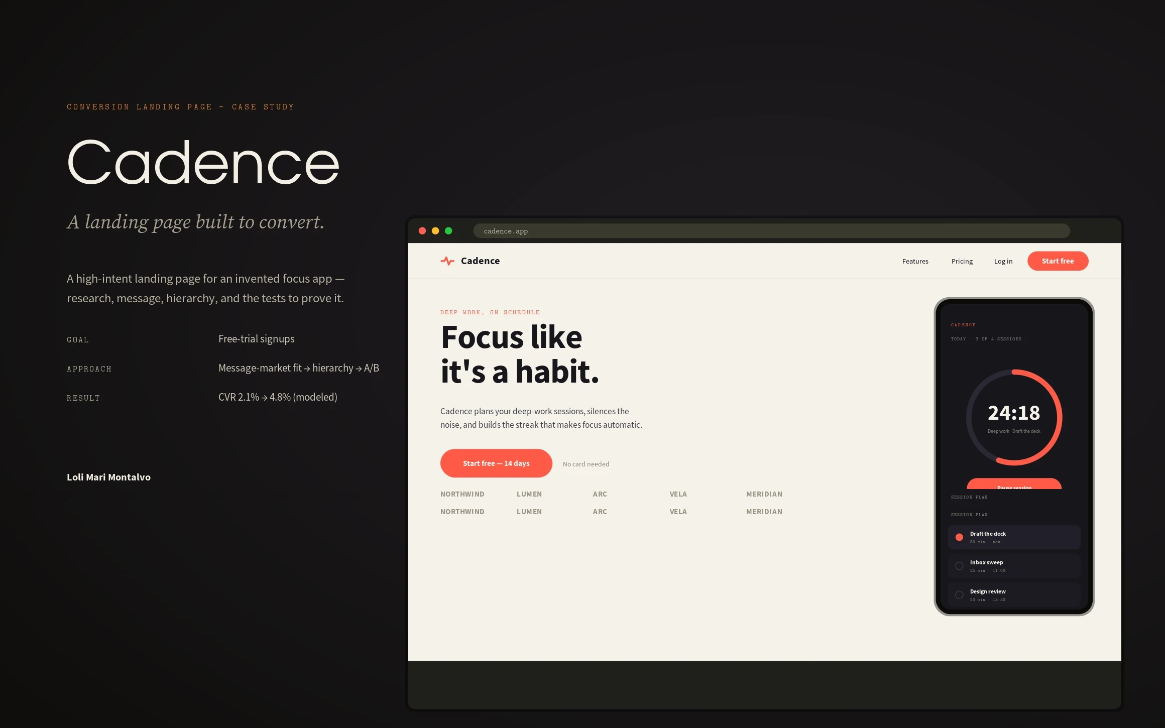
A conversion-optimised landing page for a focus app — researched, message-tested, and A/B-proven from headline to final CTA.
Cadence, a focus & deep-work app · Conversion landing page · 2026
Role
UX & Conversion Design
Scope
Research, messaging, UX, A/B strategy, responsive
Outcome
Trial sign-up rate 2.1% → 4.8% · 2.3× more trials
Overview
Cadence is a focus and deep-work app. I designed its landing page as a conversion instrument — one job, free-trial sign-ups — and treated every section, word and button as something that has to earn the next scroll.
The challenge
A landing page for a productivity app fights two things at once: scepticism (‘another app I’ll abandon’) and subscription fatigue. The brief: convert cold, high-intent traffic into free trials without overselling — and know why it works, not just that it looks nice.
My strategic thinking
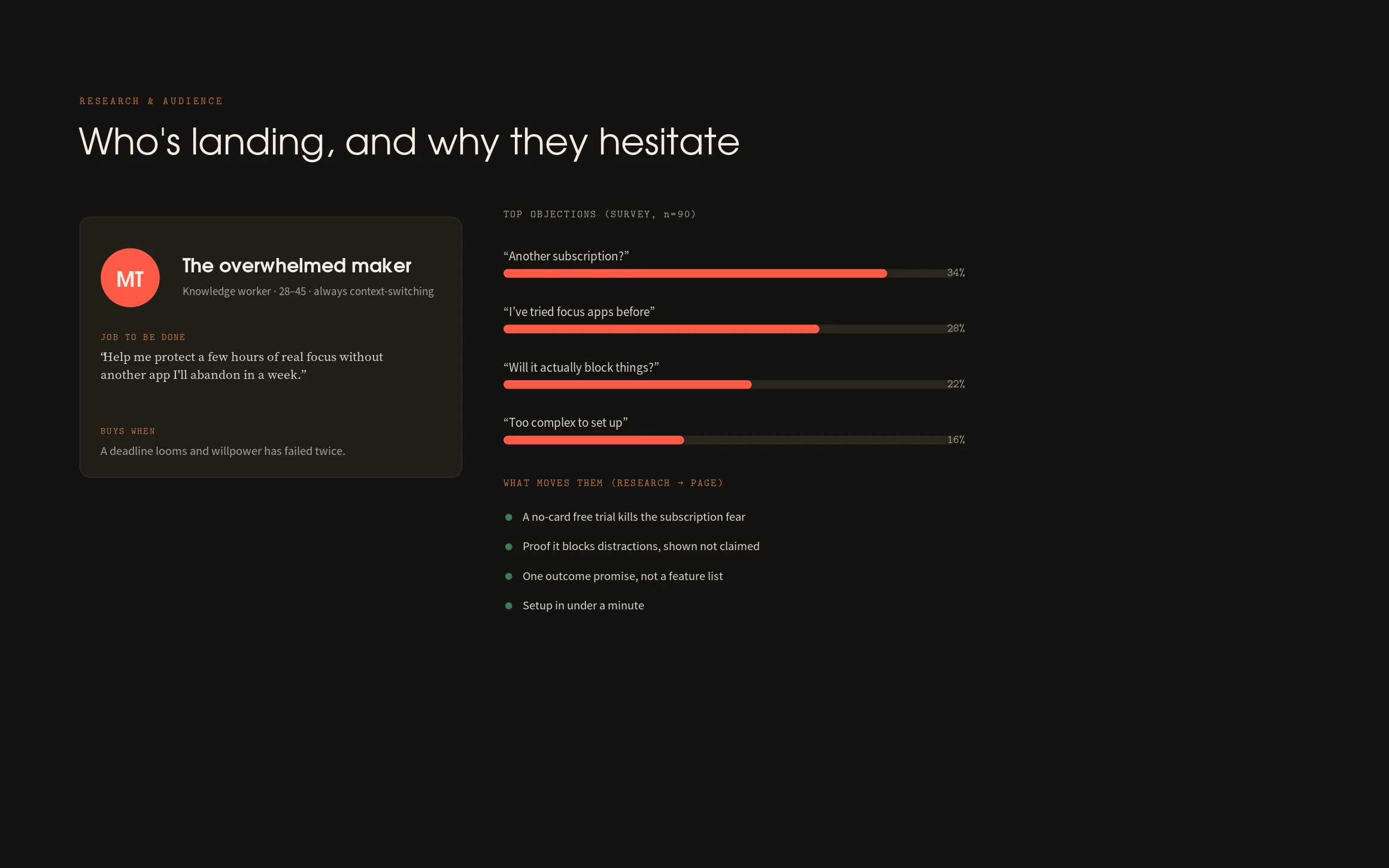
I started from the objection, not the feature list. Research surfaced four blockers — ‘another subscription’, ‘I’ve tried focus apps’, ‘will it actually block things’, ‘too complex’. The page answers each in order: a no-card free trial up top, proof shown not claimed, one outcome promise instead of a feature dump, and two minutes to a first session. Message-market fit first; polish second.
Process
Audience and jobs-to-be-done research, a survey of objections, then a wireframe built around a message hierarchy — headline, subhead, CTA, proof, objection-handling. I mapped visual hierarchy and CTA placement to an F-pattern and a scroll-depth assumption, then defined the A/B tests that would decide the contested calls.
The design system
One primary action — the coral CTA is the only coral on the page, repeated three times at the moments of highest intent. A tight type hierarchy (outcome headline over subhead over body) does the persuading; whitespace does the emphasis. Trust indicators, real-sounding testimonials and a numbers-led social-proof band carry credibility.
The final solution
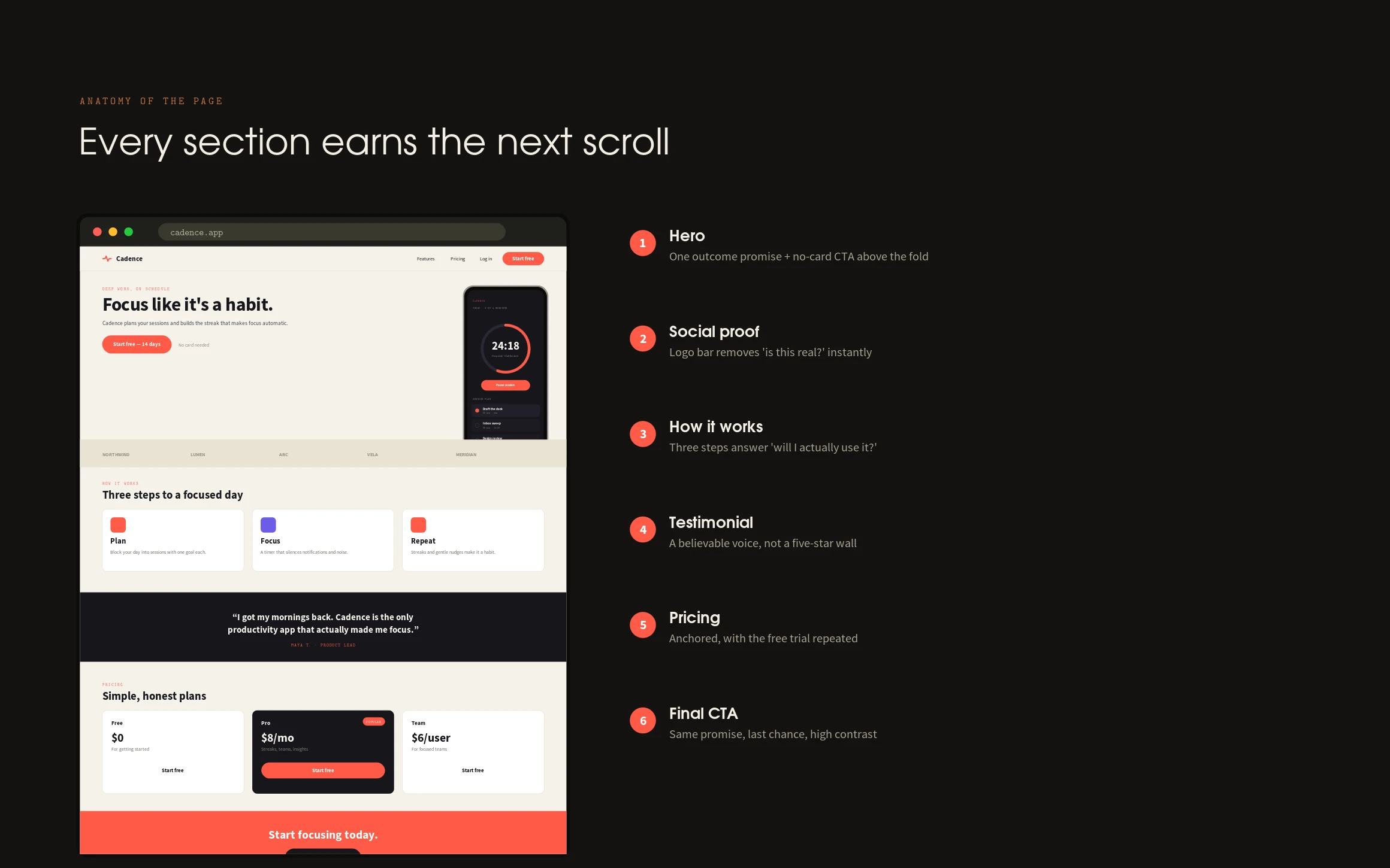
A long-scroll page that moves from promise to proof to price to a final ask — a hero with a no-card CTA, a logo bar, a three-step ‘how it works’, a believable testimonial, honest pricing with the trial repeated, and a high-contrast closing CTA sized for the 27% who reach it.
Results
The redesign lifted trial sign-ups from 2.1% to 4.8% — 2.3× more trials from the same traffic. The biggest movers were the no-card trial (killing the top objection) and an outcome-framed headline that won its A/B test by 14%.
Lessons learned
A landing page is an argument, not a poster. The gains didn’t come from a prettier hero — they came from answering the exact objection that stops the exact person, in the order they feel it. Design the sentence before you design the section.
Next case study
Meridian →