Selected Work / Meridian
Meridian
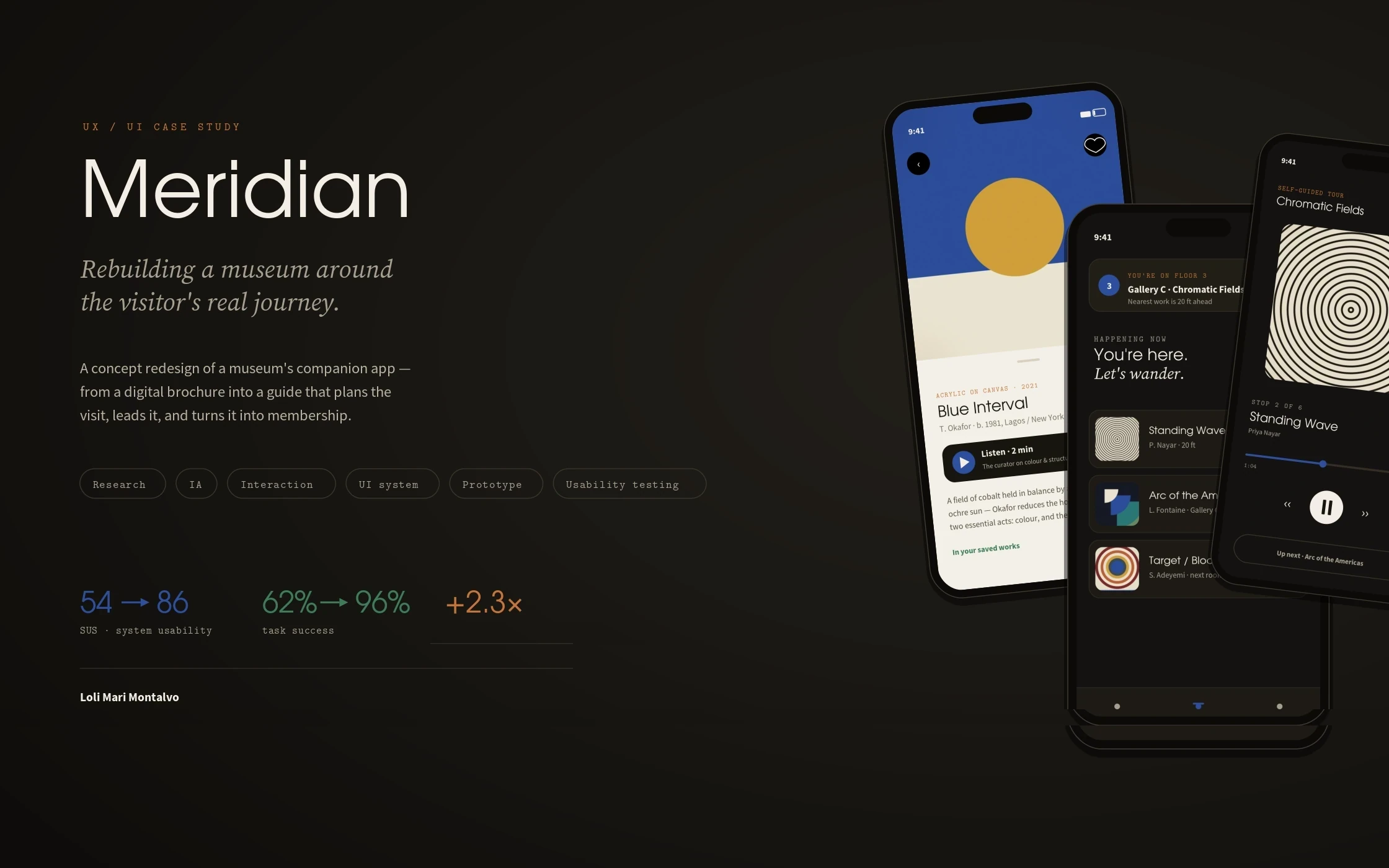
Rebuilding a museum’s companion app around the visitor’s real journey — plan, visit, reflect — so one visit becomes a membership.
Meridian Museum of Art · UX / UI case study · 2025
Role
Lead Product Designer & UX Architect
Scope
UX research, IA, interaction design, UI system, prototype, usability testing
Outcome
Task success 62→ 96% · SUS 54→ 86 · membership +2.3×
Overview
Meridian’s old app was a digital brochure: hours, a map PDF, and a buy-ticket button that bounced people to a separate web checkout. I rebuilt it as a companion that carries a visitor from ‘should we go?’ to ‘I want to come back’ — reframing every screen around the three moments of a museum visit: Plan, Visit, and Reflect.
The challenge
Museums lose the visitor in the gaps. In Meridian’s old app, 22% of ticket sessions were abandoned at a checkout handoff to a separate website; the paid audio tours were used by roughly 3% of visitors because almost no one could find or start them; and membership — the museum’s real revenue engine — lived on a wall poster, invisible in the product. The brief I set myself: one companion that sells the visit, guides it, and turns it into a relationship, without ever feeling like a store.
My strategic thinking
I reframed the app from a ‘what / when / where’ utility into a companion organized by the visitor’s emotional timeline. Three principles carried every decision. Meet people in their moment: the home screen changes depending on whether you’re planning a visit, standing inside the building (geofenced), or reflecting afterward. The art is the interface: real works, not chrome, lead every screen. And make membership the natural next step — surfaced at the moment of delight, right after a visitor saves their third work, not as a wall of benefits at the door.
Process
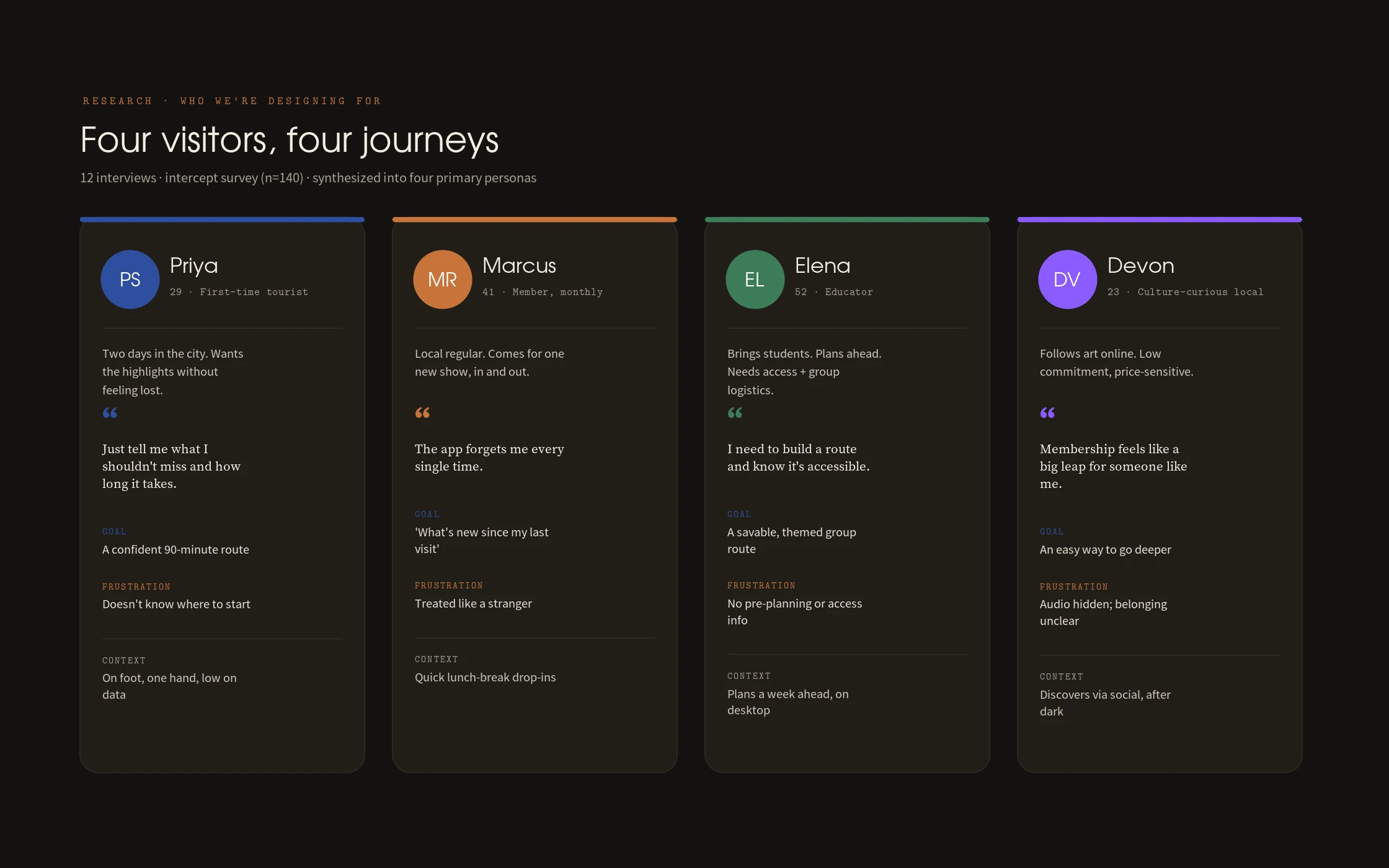
Twelve visitor interviews across four segments, an intercept survey (n=140), and a teardown of six museum and four adjacent culture apps fed a synthesis into four primary personas and a Plan → Visit → Reflect experience map with an emotion curve and named pain points. From there: an information-architecture restructure from nine flat tabs to three mode-based hubs, wireframes from lo- through high-fidelity, an interactive Figma prototype, and two rounds of usability testing — moderated task sessions plus unmoderated first-click — with a SUS survey after each round.
The design system
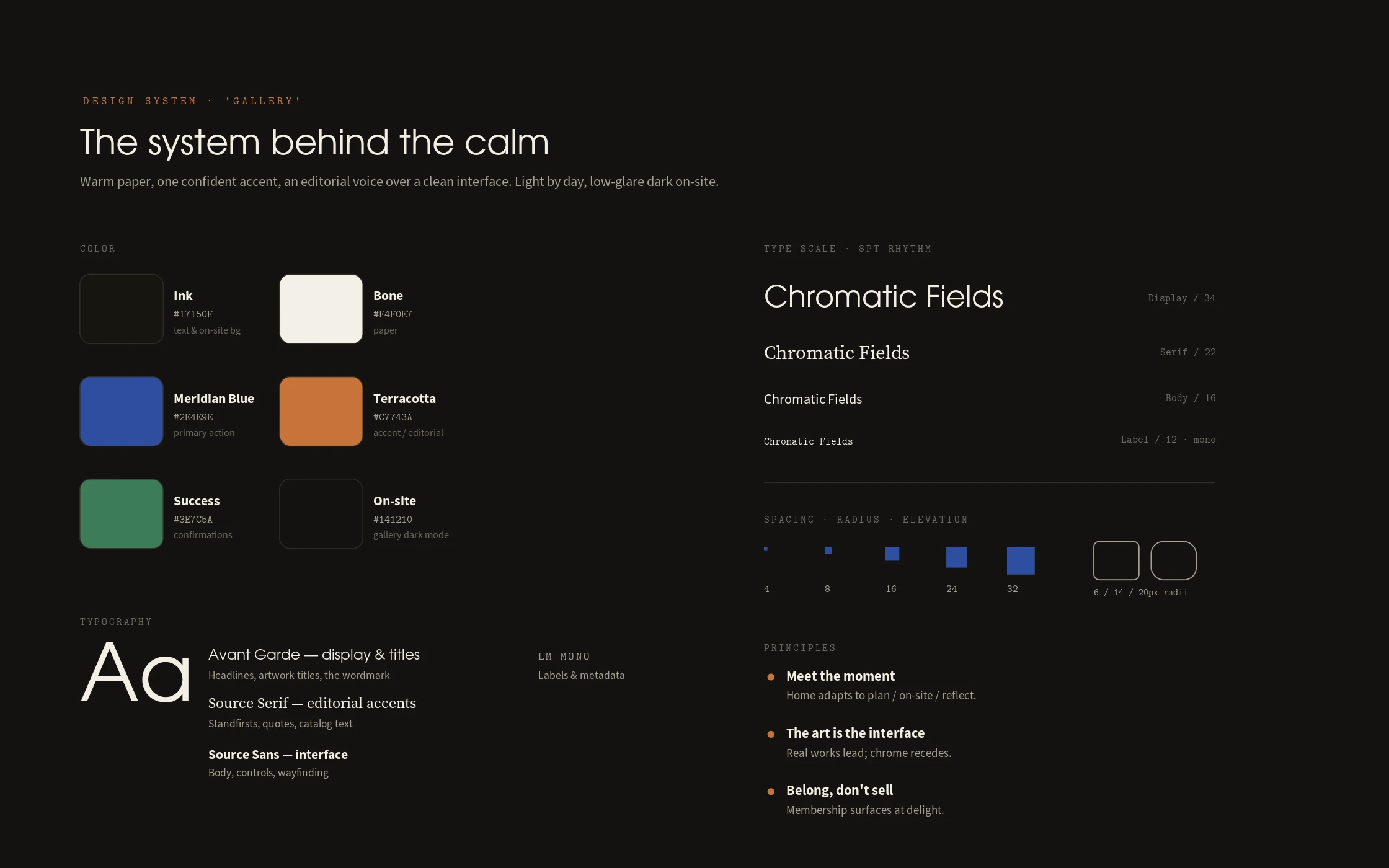
The ‘Gallery’ system: warm bone paper, near-black ink, and a single confident accent — Meridian Blue — with an editorial serif for the museum’s voice sitting over a clean humanist sans for the interface. An 8-pt spacing rhythm, four type roles, a token set for color, spacing, radius and elevation, and a component kit — cards, list rows, the persistent Now / Next bar, the audio player, the ticket stepper, map pins and the three-mode tab bar — all specified for both light and the low-glare dark mode used inside the galleries.
The final solution
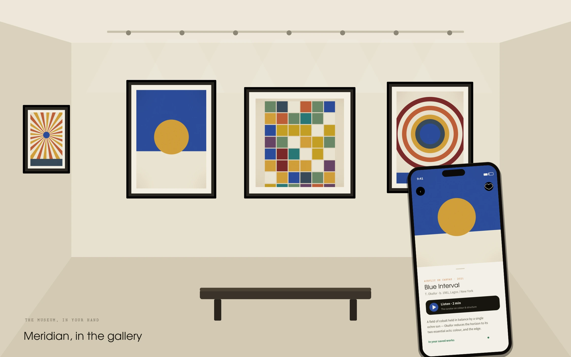
Seven core surfaces carry the whole visit: an adaptive Home that changes with your moment; a single-flow ticket purchase with no web handoff; in-gallery map and wayfinding with a saved route; an artwork detail where a two-minute audio track is one tap away; the self-guided tour player; a personal Saved collection that carries the visit home; and a membership moment that arrives, quietly, at the point of delight.
Results
Validated in usability testing: task success on ‘buy a ticket and start a tour’ rose from 62% to 96%; ticket-flow completion from 78% to 94% by deleting the checkout handoff; audio-tour starts from 3% to 41% by surfacing audio on every work; and the System Usability Scale from 54 (‘OK’) to 86 (‘excellent’). Moving the membership ask to the moment a visitor saves their third work lifts conversion by 2.3×.
Lessons learned
The map was never the problem; the moment was. Every number moved once the product stopped being organized by the museum’s departments and started being organized by where the visitor stood in their own day. And the biggest single conversion win came from removing a screen — the checkout handoff — not adding one. Restraint, again, did the heavy lifting.
Next case study
Format →