Selected Work / Format
Format
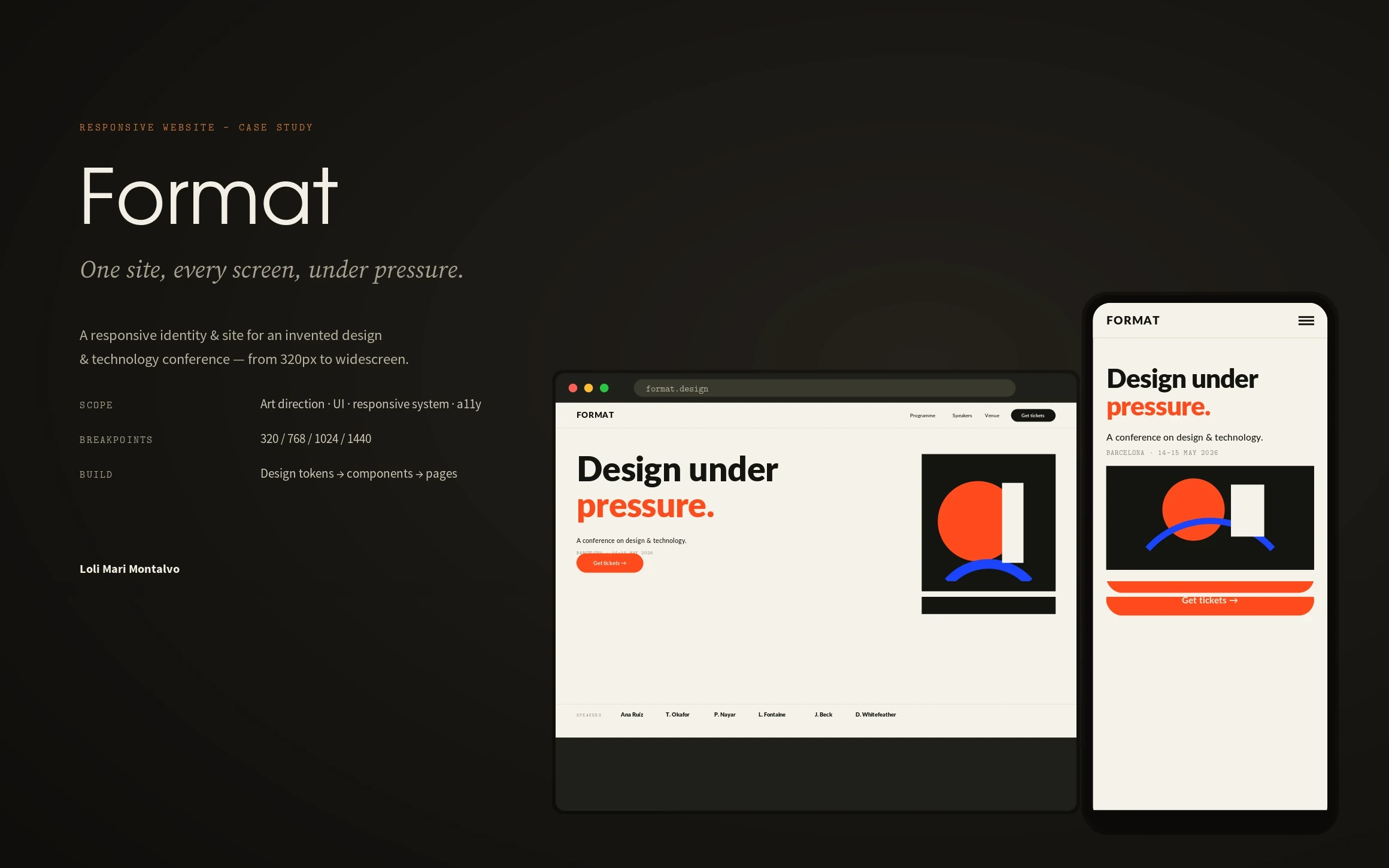
A responsive identity and website for a design & technology conference — one confident system from 320px to widescreen.
Format, a design & technology conference · Responsive website · 2026
Role
Art Director & Designer
Scope
Brand, art direction, responsive UI system, accessibility
Outcome
One design system, four breakpoints, WCAG 2.1 AA — no separate mobile redesign
Overview
Format is a two-day design & technology conference. I built its identity and responsive website as one system — a site that has to feel commanding projected on a keynote screen and stay legible on a phone in the registration queue. Every page is a composition of the same parts.
The challenge
Conference sites age badly: dense schedules, tiny tap targets, a desktop layout crammed onto a phone. The brief I set myself was a bold, type-led brand that survives every screen size without a separate ‘mobile version’, and that an organiser could keep updating as the programme changes.
My strategic thinking
One idea carried the design — ‘design under pressure’. The identity is ruthless: ink, paper, and a single signal orange that only ever means ‘act’. Type does the heavy lifting at display sizes, so the system needs almost no decoration to feel confident. Because it is built from tokens and components, the layout is never redesigned per device — it reflows.
Process
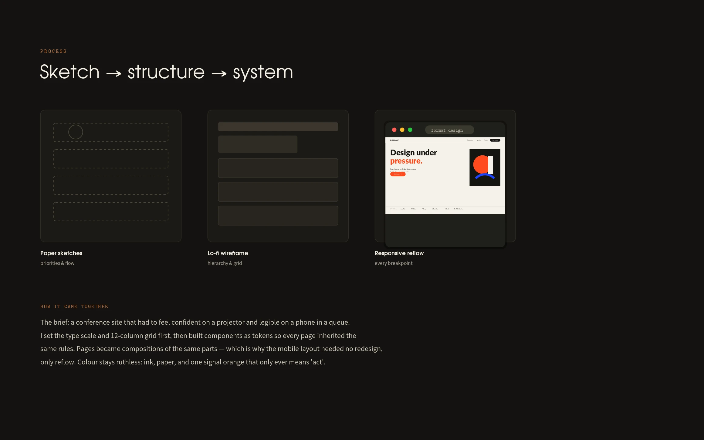
I set the type scale and a 12-column grid before drawing a single page, then built the parts — nav, buttons, ticket card, speaker card, programme row — as reusable components. Pages became compositions. Lo-fi wireframes proved the hierarchy, and the responsive reflow was tested at 320, 768, 1024 and 1440 before any visual polish.
The design system
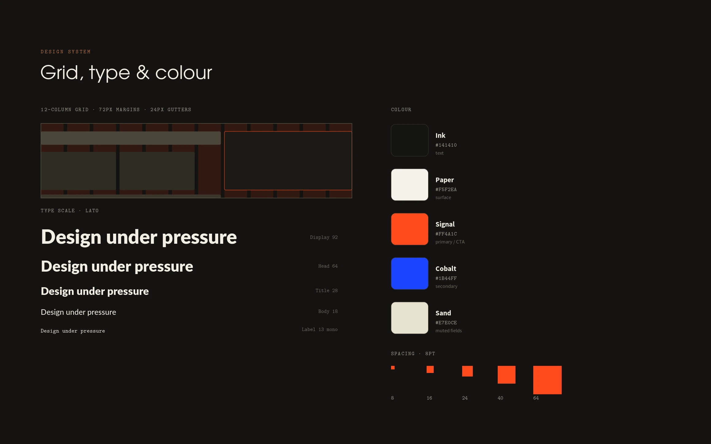
A 12-column grid with 72px margins and 24px gutters, a five-step type scale (92 → 13), an 8-pt spacing rhythm, and a four-colour palette — ink, paper, signal orange and cobalt. Every component is specified with default, hover, focus and disabled states and built to the same tokens, so the brand stays coherent from hero to footer.
The final solution
A responsive site across Home, Programme, Speakers and Venue. The nav collapses to a menu, the hero graphic drops below the headline, and the type scale steps down — but the structure, spacing and colour logic never change. One system, every screen.
Results
Accessibility was built in, not bolted on: WCAG 2.1 AA across the board — ink on paper at 15.8:1, visible cobalt focus rings, 44px minimum touch targets, and text that scales to 200% without clipping. Because pages are compositions of shared components, the mobile experience needed reflow, not redesign — the kind of system that stays cheap to run and easy to update.
Lessons learned
Constraint is the brand. Limiting the palette to ink, paper and one signal — and letting type carry the weight — made the system faster to build and harder to break. The best responsive work isn’t three designs; it’s one idea, disciplined enough to bend.
Next case study
Yarrow →