Selected Work / Yarrow
Yarrow
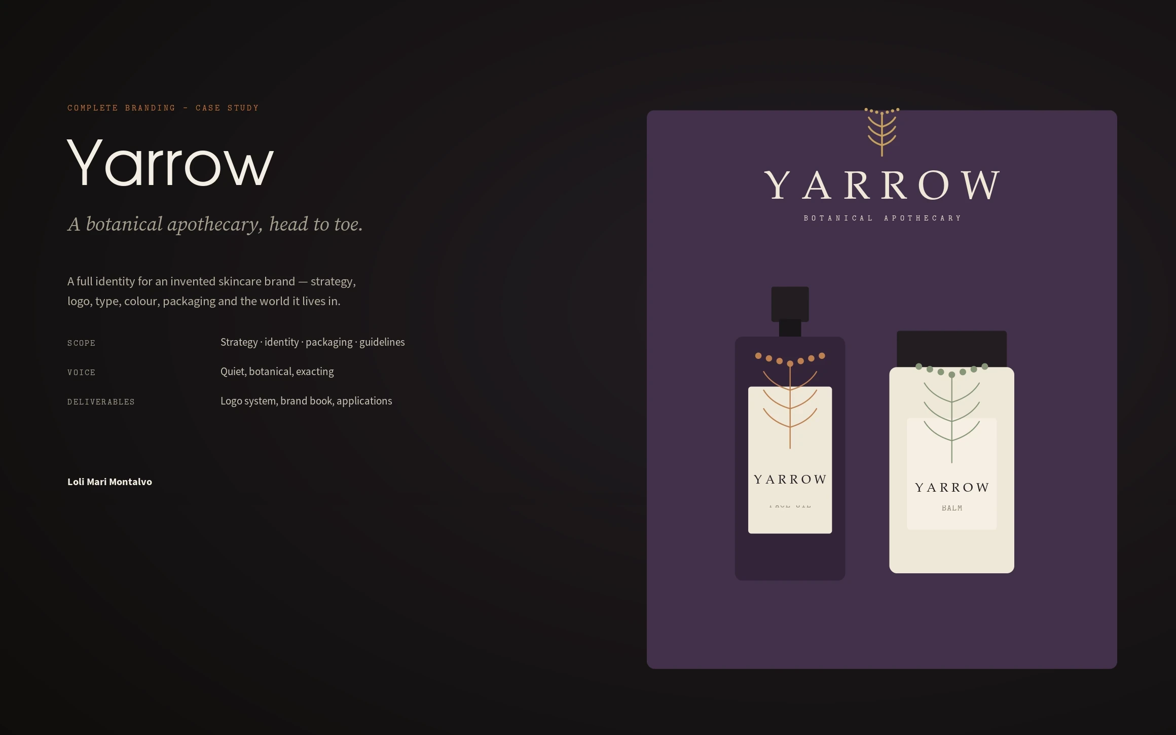
A complete brand identity for a botanical skincare apothecary — strategy, logo, type, colour, packaging and the world it lives in.
Yarrow, a botanical apothecary · Brand identity · 2026
Role
Brand Strategy & Identity
Scope
Strategy, identity, packaging, guidelines
Outcome
One coherent system from wordmark to shelf, print to screen
Overview
Yarrow is a botanical apothecary — a small skincare line built on the idea that care should feel like a ritual, not a routine. I created the whole identity: the strategy, a wordmark and mark, the type and colour system, a packaging range, and the guidelines that keep it coherent.
The challenge
Skincare is a shouting match — clinical claims, glossy gradients, near-identical minimalism. The brief I set: a brand that feels like an apothecary shelf, not a lab; warm and exacting, quiet enough to stand out; and a system disciplined enough that a growing product range still reads as one family.
My strategic thinking
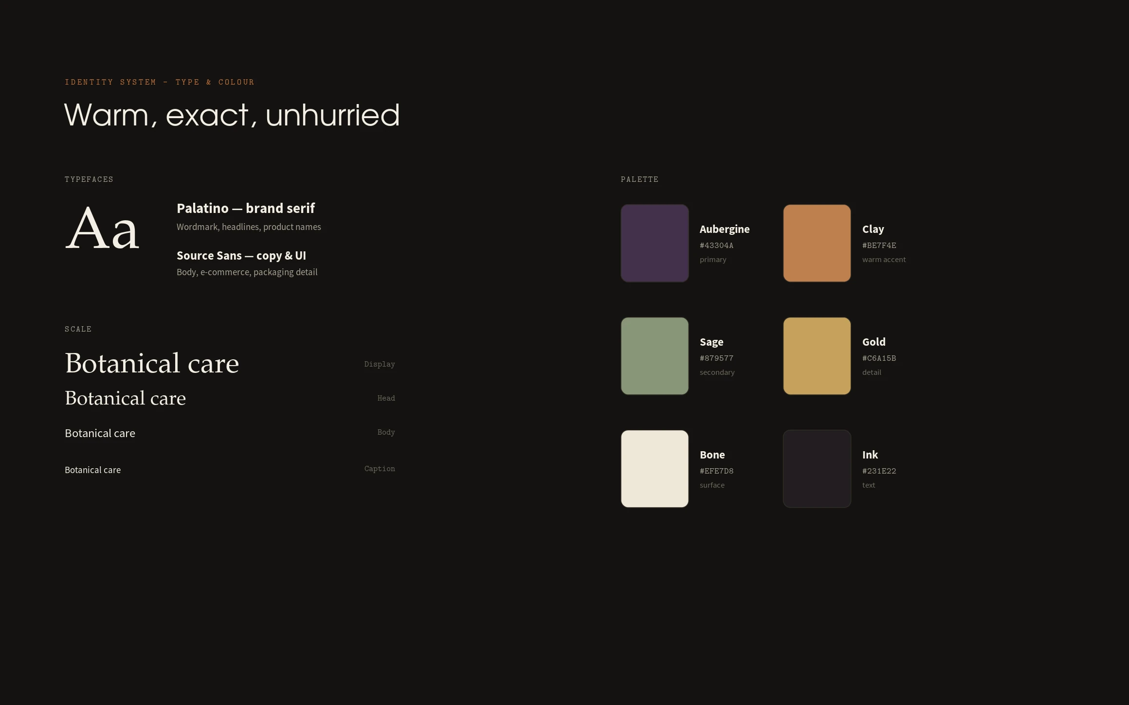
I positioned Yarrow between clinical and sensorial, on the craft end of the market — where the product feels made, not manufactured. That single decision drove everything: a Palatino wordmark and a hand-drawn yarrow sprig for warmth, an aubergine-and-clay palette that photographs like dried botanicals, and copy that under-claims. Colour, not shape, does the sorting across the range.
Process
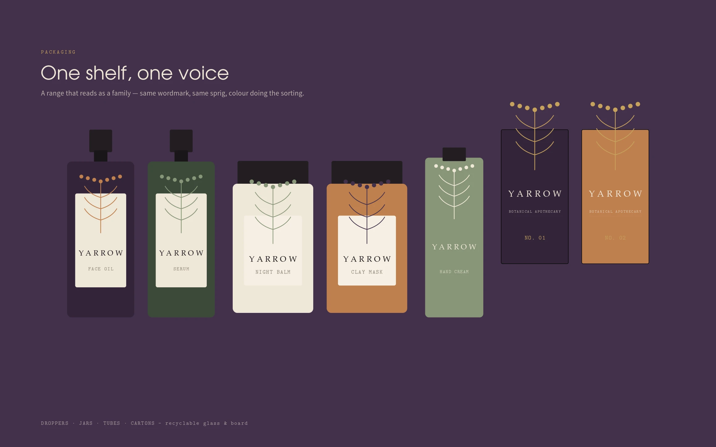
Strategy first — mission, attributes, and a positioning map — then identity exploration: the wordmark, the sprig mark, and how they lock up. From there the type and colour system, a botanical icon set and pattern, and the packaging architecture: one label system, colour-coded by product.
The design system
A high-contrast serif (Palatino) for the brand voice over a clean humanist sans for detail; a palette of aubergine, clay, sage, gold, bone and ink with full print and screen values; a drawn icon set and seamless pattern; and a logo system with clearspace, minimum sizes and reversals — all documented in a 32-page brand book.
The final solution
The identity runs from wordmark to shelf — droppers, jars, tubes and cartons that read as a family; stationery and a tote; a social grid that mirrors the packaging; and an e-commerce look that carries the same restraint. Every touchpoint uses the same three moves: wordmark, sprig, one accent colour.
Results
One coherent system, print to screen. The packaging range scales — a new product is a new colour and name in the existing label, not a new design — and the guidelines make it hard to get wrong. It’s the kind of identity a small team can grow without a designer in the room for every SKU.
Lessons learned
Identity is a set of constraints you can hand over. The work that makes a brand feel expensive isn’t a clever logo; it’s a system so clear that the tenth product looks as considered as the first. Restraint, made repeatable.
Next case study
Dream Logic →