Selected Work / Marea
Marea
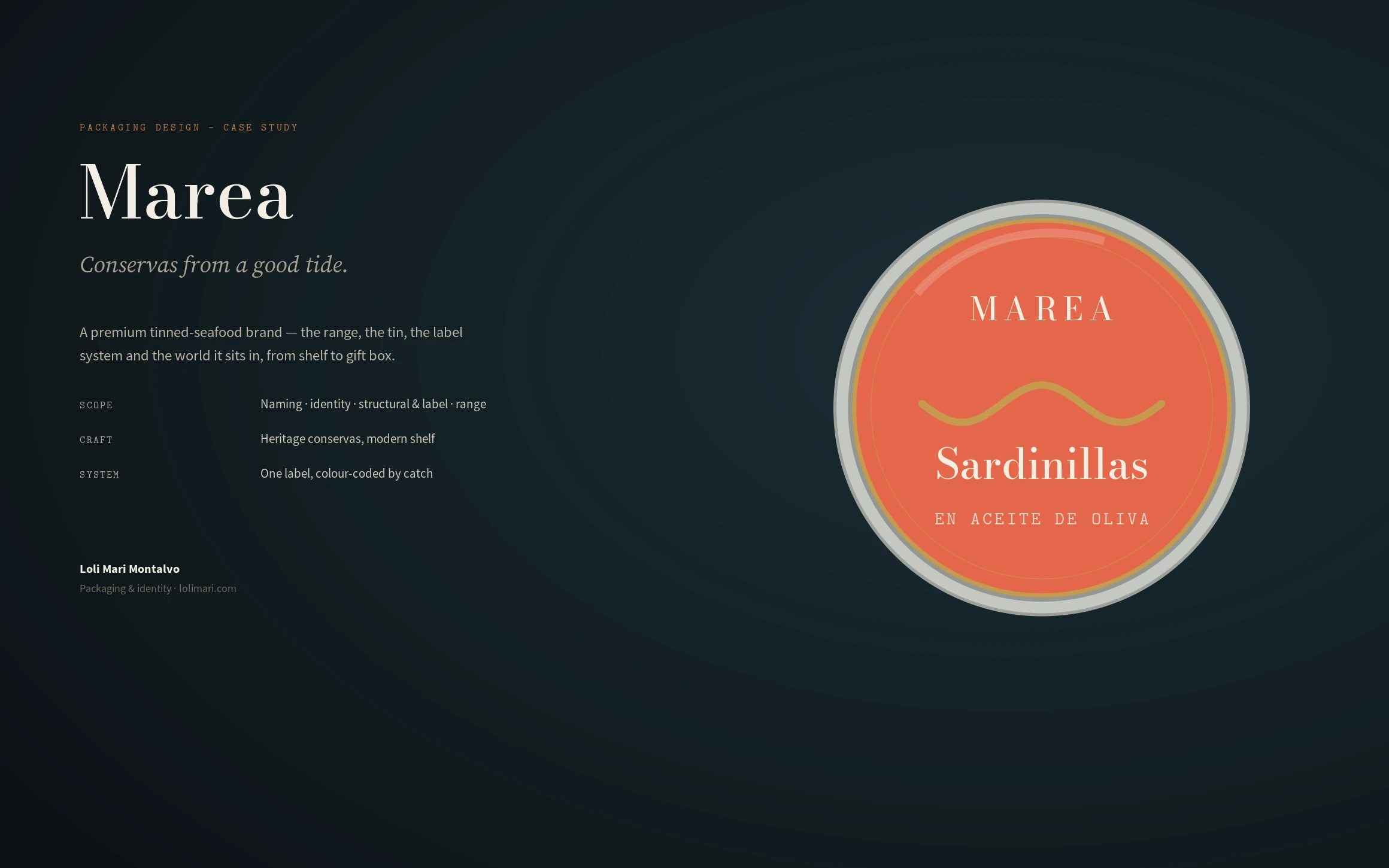
A premium tinned-seafood brand — naming, identity, structural and label system for a range colour-coded by catch.
Marea, a conservas maker · Packaging design · 2026
Role
Packaging & Identity Design
Scope
Naming, identity, structural & label, range
Outcome
One label system that scales catch by catch
Overview
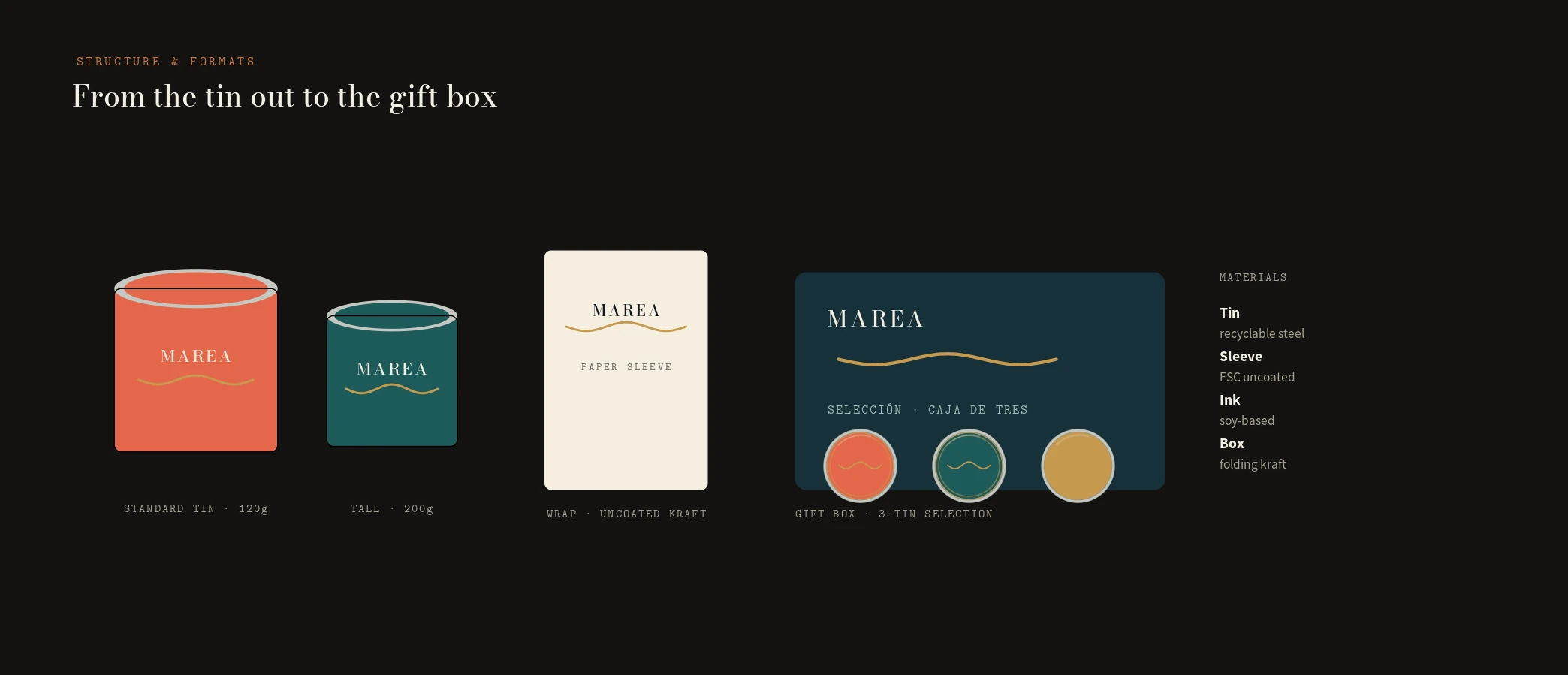
Marea is a maker of conservas — premium tinned seafood in the Galician tradition. I built the brand from the name out: the identity, a structural and label system for the tin, a range colour-coded by catch, and the formats it ships in, from a single tin to a three-tin gift box.
The challenge
Conservas is a crowded, romantic category — every tin leans on nostalgia, old engravings and gold foil until the shelf turns into noise. And a good range grows: new catches arrive every season. The brief I set: a brand that feels heritage but reads modern, and a tin system that can add a product without redesigning anything.
My strategic thinking
I made the tin one system with a single variable. A Didone wordmark set into the metal, a single tide motif, and a gold thread run across every tin — the constants. The catch changes only the colour and the name. That one decision turns a range into a family: the shelf reads as one brand, and a new product is a new colour, not a new design.
Process
Naming and positioning first — Marea, the tide, the idea of a good catch — then the label architecture: wordmark, tide motif, catch name, origin and preparation. From there the colour system for the range, the structural formats (standard and tall tins, a paper sleeve, a gift box), and the material and sustainability choices.
The design system
A high-contrast Didone for the wordmark and catch names over Source Sans for the honest back-of-tin detail; a palette of deep navy and tide teal with a brass thread and a set of catch colours; and one label layout with fixed proportions where only the colour and name move. Recyclable steel, FSC uncoated sleeve, soy inks — documented so production stays consistent.
The final solution
Six catches, one system — Sardinillas, Mejillones, Pulpo, Ventresca, Berberechos, Anchoas — each unmistakably Marea. It runs from the tin to a paper sleeve to a navy gift box of three, and carries onto the shelf, the feed and an e-commerce page built from the same wordmark, tide motif and single accent.
Results
A range that grows without a redesign. Adding a catch is choosing a colour and a name in the existing label — the tooling, the layout and the brand thread never change. The shelf stays coherent as the line expands, and a small team can extend it without a designer for every SKU.
Lessons learned
In packaging, the system is the product. The romance of a category is easy to copy; what's hard, and what lasts, is a structure disciplined enough that the tenth tin looks as considered as the first. Design the variable, then hold everything else still.
Next case study
Bruta →