Selected Work / Bruta
Bruta
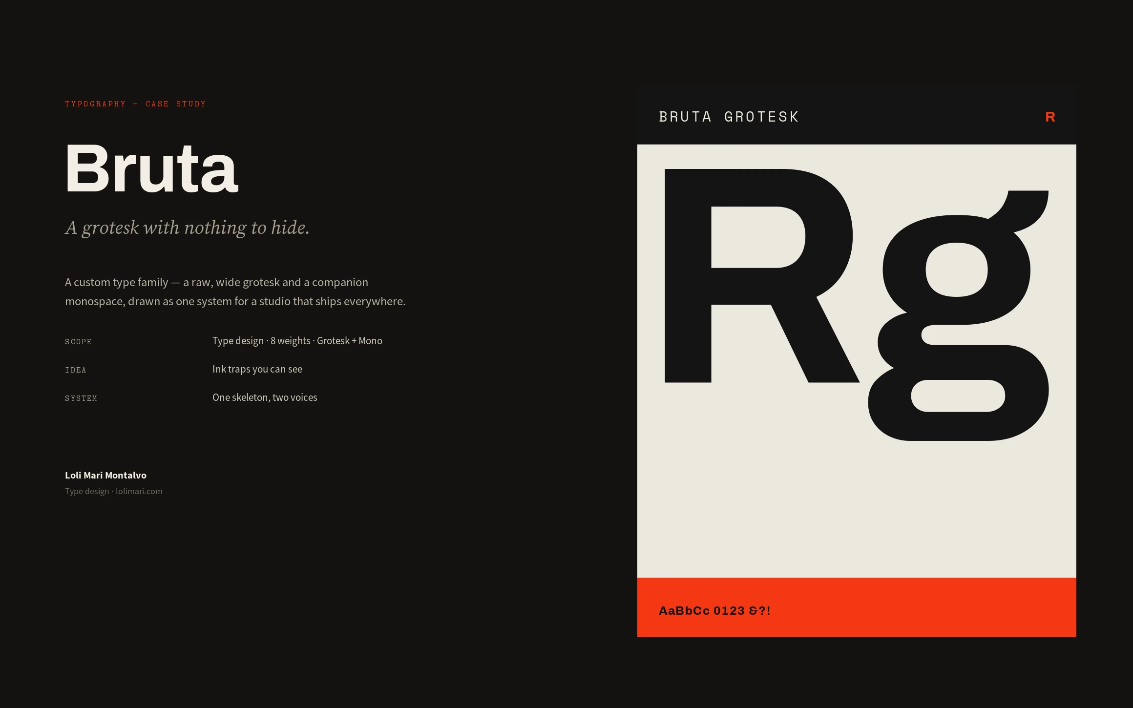
A custom type family — a raw, wide grotesk and a companion monospace, drawn as one system.
Bruta, a custom typeface · Type design · 2026
Role
Type Design
Scope
Type design, 8 weights, Grotesk + Mono
Outcome
One skeleton, two voices, from code editor to festival wall
Overview
Bruta is a custom type family — a raw, wide grotesk with a companion monospace, drawn as a single system. I designed the whole thing: the letterforms and their anatomy, eight weights with italics, the OpenType features, and the specimen that shows it working from a code editor to a festival wall.
The challenge
A studio that ships everywhere — screens, print, code, signage — was renting three unrelated fonts that never quite agreed. The brief I set: one family with a strong display voice and a genuinely useful text and code cut, drawn on a shared skeleton so the headline, the paragraph and the terminal all look like the same hand.
My strategic thinking
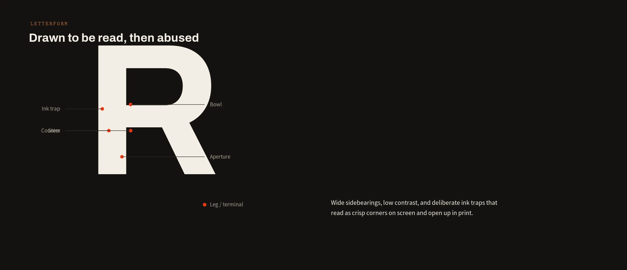
I gave Bruta one skeleton and two voices: a wide, low-contrast grotesk that turns brutal at display sizes and stays quiet at text sizes, plus a fixed-width mono for code, data and captions. Deliberate ink traps read as crisp corners on screen and open up in print — the same forms, tuned for where they live.
Process
Skeleton first — proportions, sidebearings and the key letters that set the tone — then the weight axis from Thin to Black, italics, and the monospace companion. From there the OpenType layer: ligatures, stylistic alternates, tabular and oldstyle numerals, case-sensitive forms and extended language coverage, all proofed in a working specimen.
The design system
Bruta Grotesk in eight weights with matching italics over Bruta Mono, one fixed-width companion; a documented anatomy — stems, bowls, apertures and the signature ink traps; and a full OpenType feature set. The specimen doubles as the spec: every cut, size and feature shown the way it will actually be used.
The final solution
One family that does the studio's whole job. Black cuts carry posters and wayfinding, the regular sets editorial, and the mono handles code and UI — all unmistakably Bruta. The specimen shows it in a poster, an editorial spread, a code editor and a signage panel, from the same forms.
Results
Three rented fonts became one owned system. The studio's work reads as one voice across every medium, licensing is simplified to a single family, and new applications start from a specimen that already answers most questions — the type stops being a decision made per project.
Lessons learned
A typeface is infrastructure. The interesting part isn't a clever letter; it's a skeleton disciplined enough to carry a display cut, a text cut and a monospace without any of them feeling like a compromise. Draw the system, and the letters follow.
Next case study
Nocturne →