Selected Work / Nocturne
Nocturne
Art direction for a quarterly arts & culture magazine — grid, type system, cover architecture and feature spreads.
Nocturne, a quarterly magazine · Editorial design · 2026
Role
Art Direction & Editorial Design
Scope
Art direction, grid, type, cover system
Outcome
One grid holding ninety-six pages, four issues a year
Overview
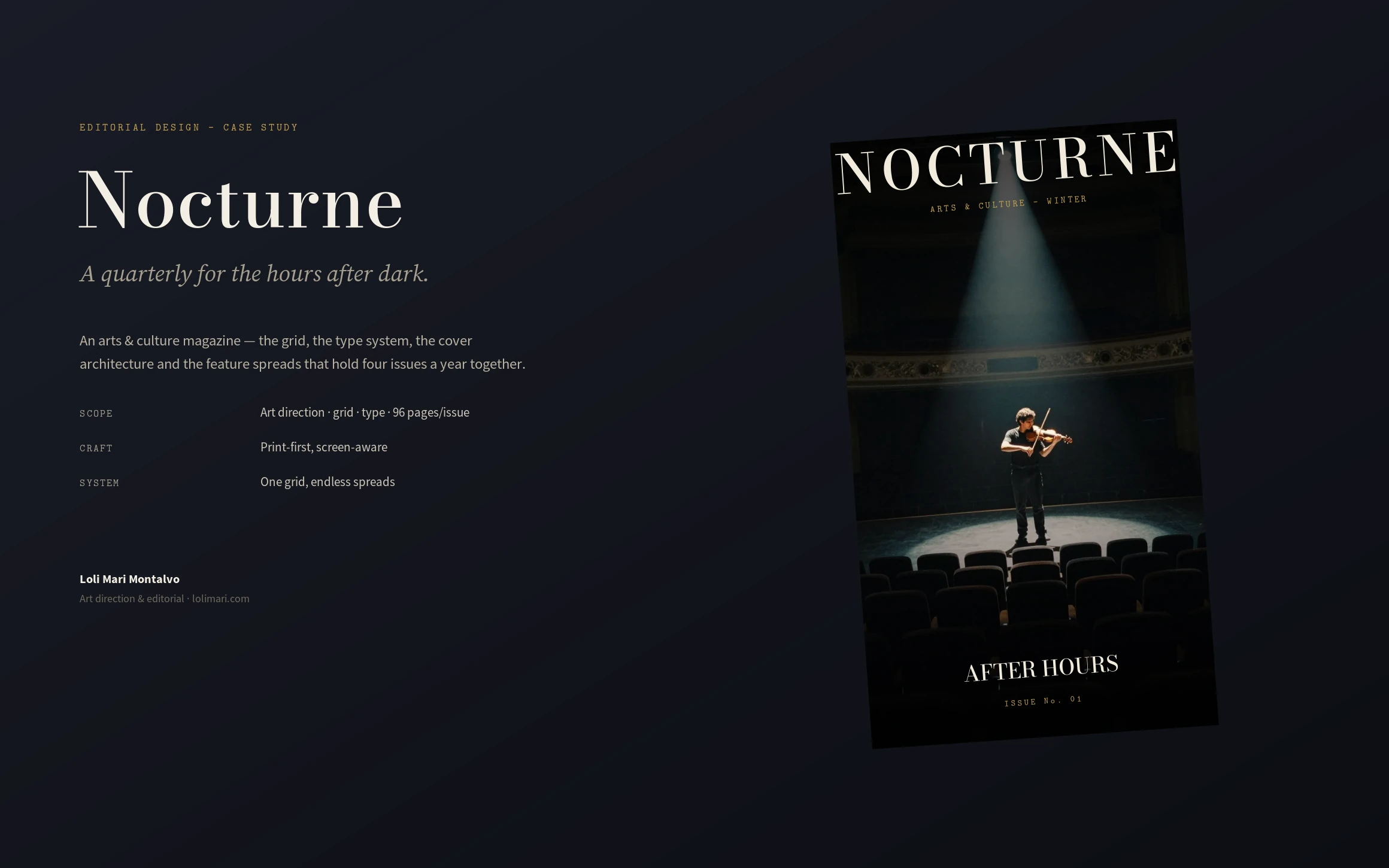
Nocturne is a quarterly arts & culture magazine — ninety-six pages an issue, four issues a year. I art-directed the whole thing: the grid, the type system, the cover architecture, and the feature-spread language that keeps a magazine of many voices reading as one publication.
The challenge
A magazine is the hardest kind of system: it has to feel fresh every issue and identical every issue at the same time. Too rigid and it reads like a template; too loose and the shelf falls apart. The brief I set: a framework a small editorial team can pour new stories into on deadline, that still looks art-directed on every page.
My strategic thinking
I built one grid and one type system and let the images and headlines do the changing. A twelve-column grid on an 8-point baseline holds everything; a high-contrast Didone carries the drama of the openers while a calm serif carries the read. The cover architecture fixes the masthead and moves only the season colour, the image and one coverline — so four issues read as one shelf.
Process
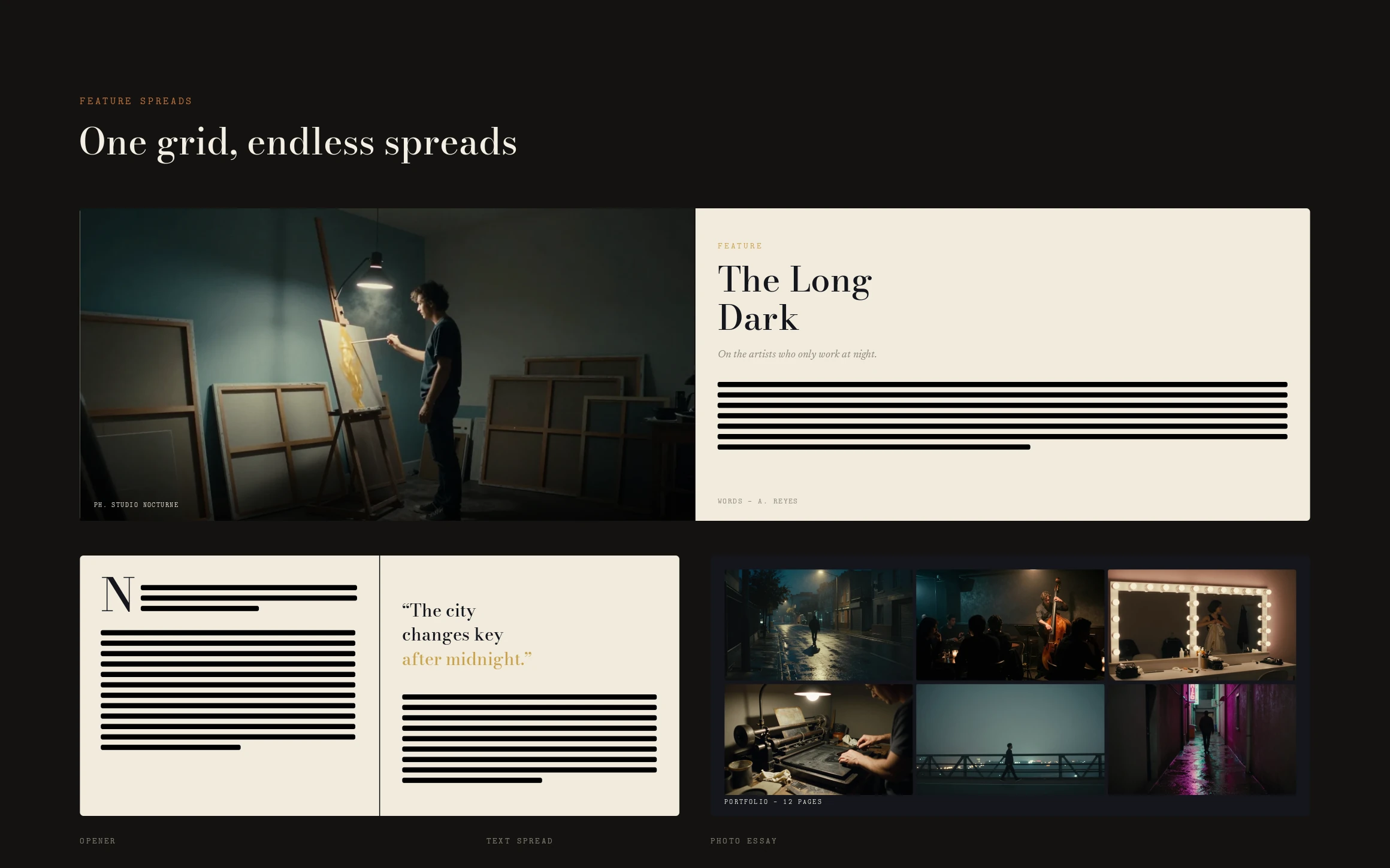
Grid and baseline first, then the type system across masthead, headline, deck, body, caption and folio. From there the feature-spread language — openers, text spreads and photo essays — the cover template, and the editorial furniture: contents, drop caps, pull quotes, section dividers and folios, all proofed as real spreads.
The design system
A twelve-column grid with symmetric margins on an 8-point baseline; a Didone-and-serif type system with a monospace for captions and folios; a cover architecture with a fixed masthead and a per-season colour; and a spread library — opener, text, photo essay — plus the standing furniture that makes an issue feel finished.
The final solution
One grid, endless spreads. The feature openers run big and cinematic, the text spreads stay quiet and readable, the photo essays breathe, and the covers line up as a set across Winter, Spring, Summer and Autumn — all from the same framework, masthead and type.
Results
A magazine the team can actually make on deadline. New stories drop into an existing spread language instead of being designed from scratch, the covers stay recognisable issue to issue, and the publication reads as one art-directed voice across ninety-six pages — every quarter.
Lessons learned
Editorial design is rhythm, not layout. The craft isn't a beautiful spread; it's a framework flexible enough to surprise and strict enough to stay coherent across a year of issues made by many hands. Set the tempo, and the pages keep time.
Next case study
Orbit →