Selected Work / Frequency
Frequency
A dynamic brand identity for a music & podcast network — one mark that flexes to every show, genre and moment.
Frequency, a music & podcast network · Brand identity system · 2026
Role
Brand Strategy & Identity
Scope
Strategy, dynamic identity, motion, guidelines
Outcome
One system, an unmistakable mark for every programme
Overview
Frequency is a music & podcast network — dozens of shows under one roof, from jazz to talk to late-night electronic. I built the whole identity system: the strategy, a dynamic logo, the motion language, the type and colour, and the guidelines that hold it together as the network grows.
The challenge
A network is not one brand, it is many voices that still need to feel like one place. A static logo either flattens every show into sameness or gets ignored the moment a producer wants their programme to feel distinct. The brief I set: a single identity flexible enough to give every show its own character, disciplined enough that it always reads as Frequency.
My strategic thinking
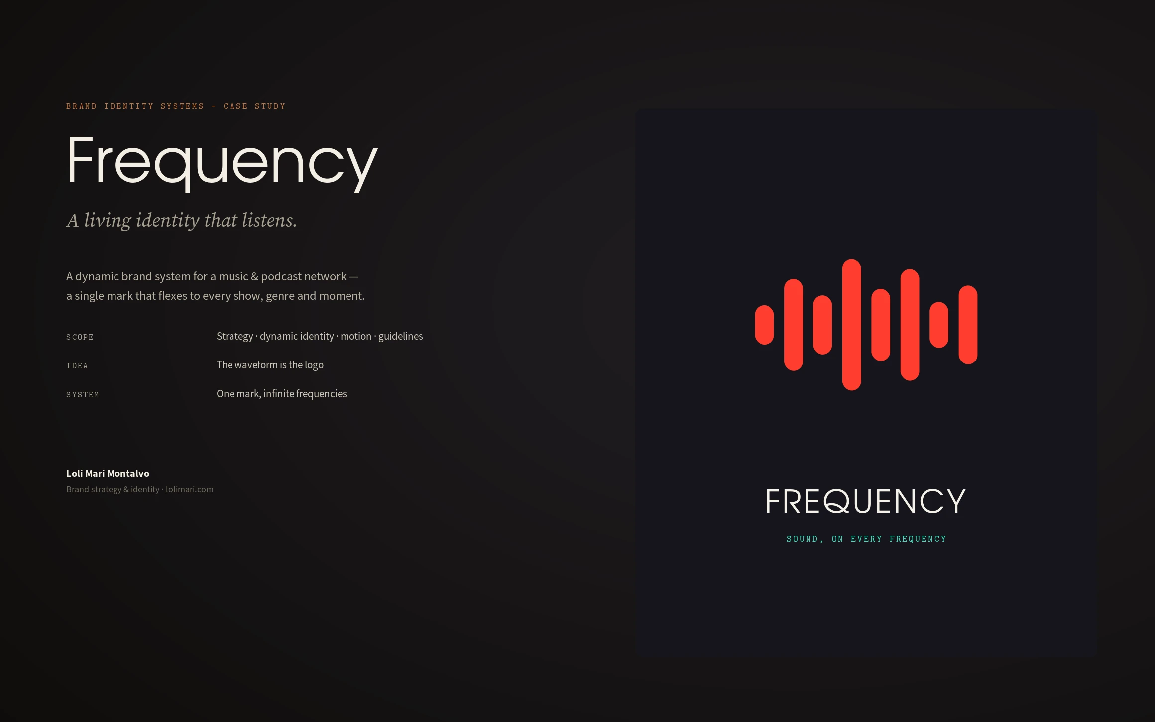
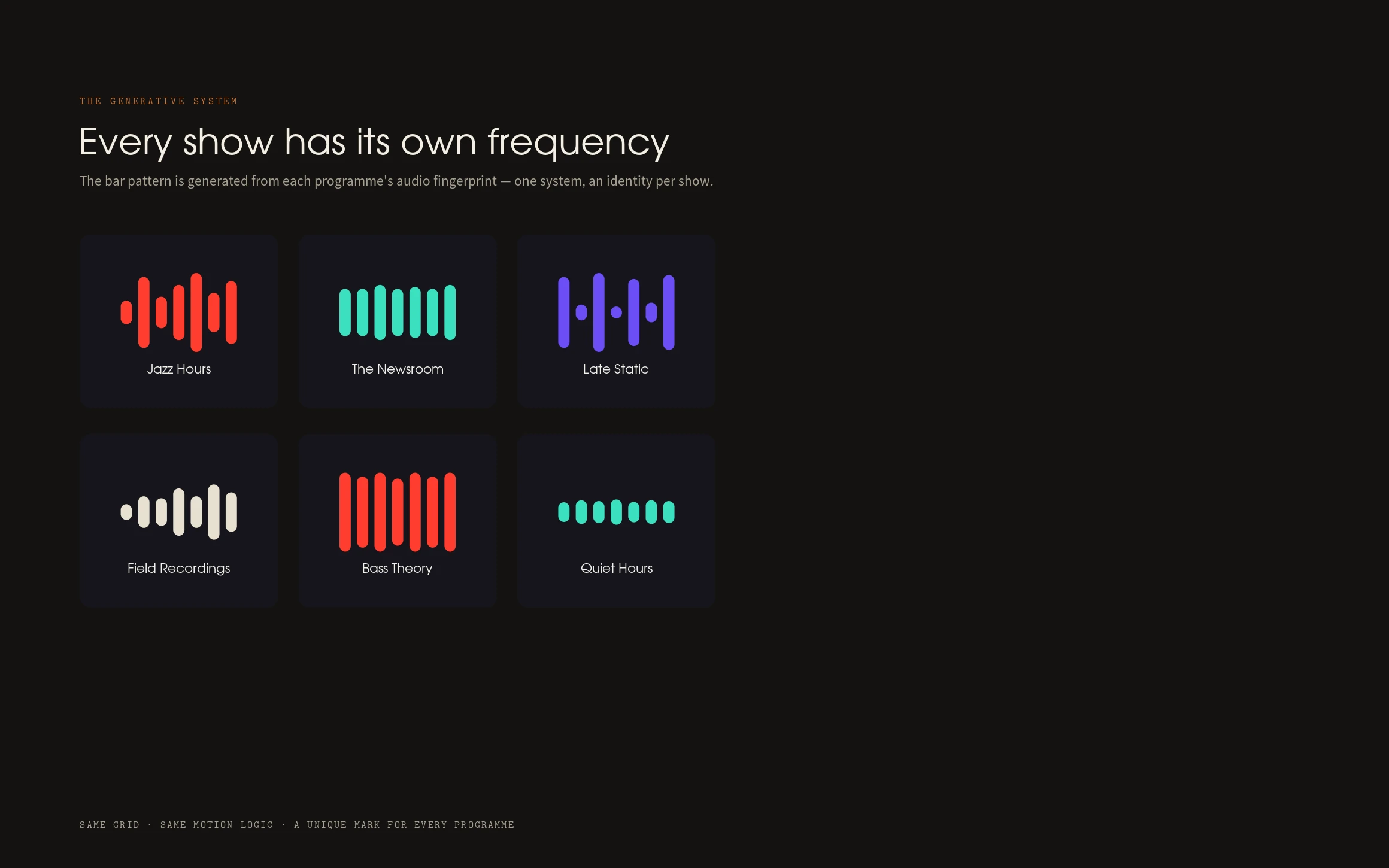
I made the waveform the logo. Instead of a fixed mark, Frequency is a set of vertical bars on a shared grid — an equalizer that every show tunes to its own pattern, generated from its audio. One system, an infinite family of marks. The logo does not just represent sound; it behaves like it.
Process
Strategy first — the network's positioning and the promise that sound lives on every frequency. Then the mark: the bar grid, its proportions, clearspace and minimum sizes, and the on-air / playing / paused states. From there the generative rules per show, the motion curves, the type and colour system, and the applications across app, covers, social and out-of-home.
The design system
Avant Garde for the wordmark and on-air chrome over Source Sans for interface and body; an ink-and-bone base with a signal red accent plus mint and violet for secondary states; and the waveform mark as a living component with fixed proportions, defined states, and motion that eases on a shared curve and degrades gracefully to a static mark where motion isn't supported.
The final solution
One mark, infinite frequencies. Every show gets its own bar pattern from the same grid — Jazz Hours, The Newsroom, Late Static, Bass Theory — each unmistakably part of the network. The system runs from a phone player to a festival wall: app UI, podcast covers, social and OOH, all built from the same three moves — wordmark, waveform, one accent.
Results
A brand a producer can extend without a designer in the room. Adding a show is generating a new pattern in the existing system, not designing a new logo. The identity scales with the network and stays coherent because the grid, the motion and the colour logic never change — only the frequency does.
Lessons learned
The strongest systems are rules, not artifacts. A logo that can change on purpose is far harder to design than one that never moves — but it is the only kind that survives a network of voices. Build the instrument, not just the note.
Next case study
Meridian →