Selected Work / Culture Medium
Culture Medium
Identity grown like a living specimen — and reduced to a single witty mark.
Advertising campaign · 2025
Role
Creative Director & Artist
Scope
Digital art series & conceptual icon system
Outcome
Two paired bodies of work — one lush, one minimal — on culture as something cultivated
Challenge
I wanted to say something true about cultural identity without flattening it into a slogan or a single illustration. Heritage isn’t a fixed portrait — it grows, divides, code-switches, and refuses to stay in one frame. The challenge was to build work that holds that contradiction: lush and alive on one side, sharp and reductive on the other, both unmistakably the same point of view.
Opportunity
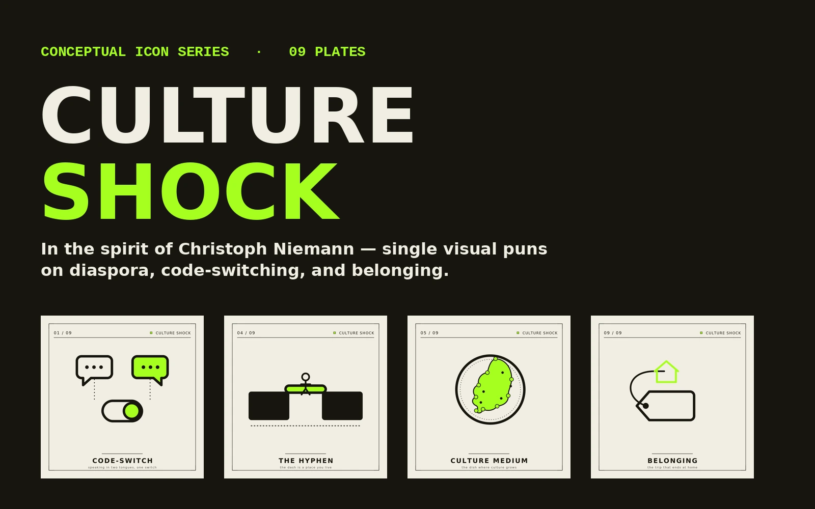
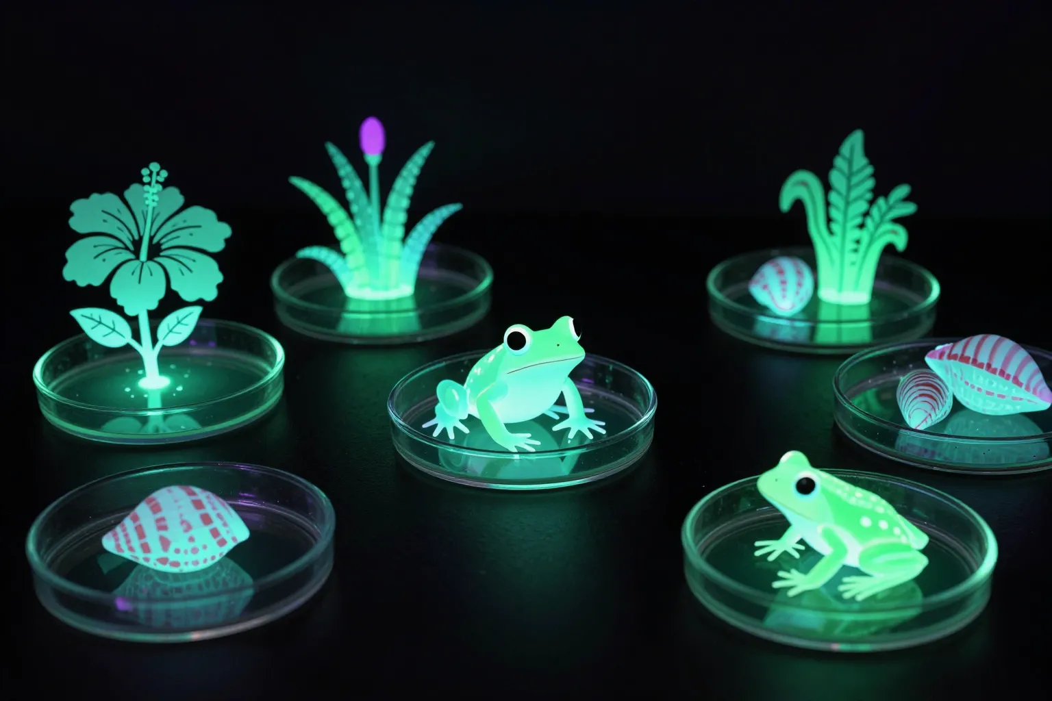
Two registers, one idea. ‘Culture’ is both a heritage and a thing you grow in a dish — a culture medium. That double meaning let me build a pair of series that argue the same thesis from opposite ends: Culture Medium in saturated, fluorescent digital paint, and Culture Shock as flat conceptual icons. The contrast is the concept.
Strategy
Lock one visual DNA across both. A single fluorescent act of color — the living-culture glow — carries through the lush digital work and the minimal icons alike, so two very different surfaces read as one family. Culture Medium grows the idea; Culture Shock reduces it to a single pun per plate. A shared accent, a shared subject, two opposite reductions.
Process
Culture Medium was built in Illustrator and Photoshop — vector edge layered into photographic depth, color pushed to a near-radioactive bloom so each piece reads like a specimen under blacklight. Culture Shock was drawn the opposite way: each concept sketched down to its single sharpest move — a light switch that is two languages, roots that are flight paths — then mastered as 1:1 vectors that scale from web to print.
Creative Direction
Held the constraint that ties the two together: one fluorescent act per icon, no exceptions, and a strict ink-on-paper ground so the color always means something. In the spirit of Christoph Niemann — if a plate needed a caption to explain it, the idea wasn’t reduced enough yet. The discipline is the authorship; a viewer can feel the system was built, not improvised.
Outcome
A paired body of work with a clear point of view: a glowing digital series and a nine-plate conceptual icon system, legible as a designed whole. Exhibition-ready as a grid, print-ready as a square drop, and a reusable visual grammar for talking about culture as a living process.
Lessons learned
The same idea is stronger said twice in two voices — once lush, once stripped bare. Reduction didn’t cost the work meaning; it concentrated it.
Next case study
The Animal Within →