Selected Work / Ánima
Ánima
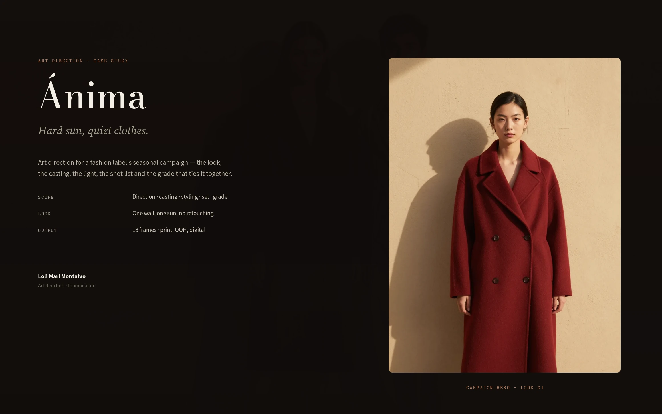
Art direction for a fashion label's seasonal campaign — the look, the casting, the light, the shot list and the grade.
Ánima, a fashion label · Art direction · 2026
Role
Art Direction
Scope
Direction, casting, styling, set, grade
Outcome
A whole season from one wall and one afternoon
Overview
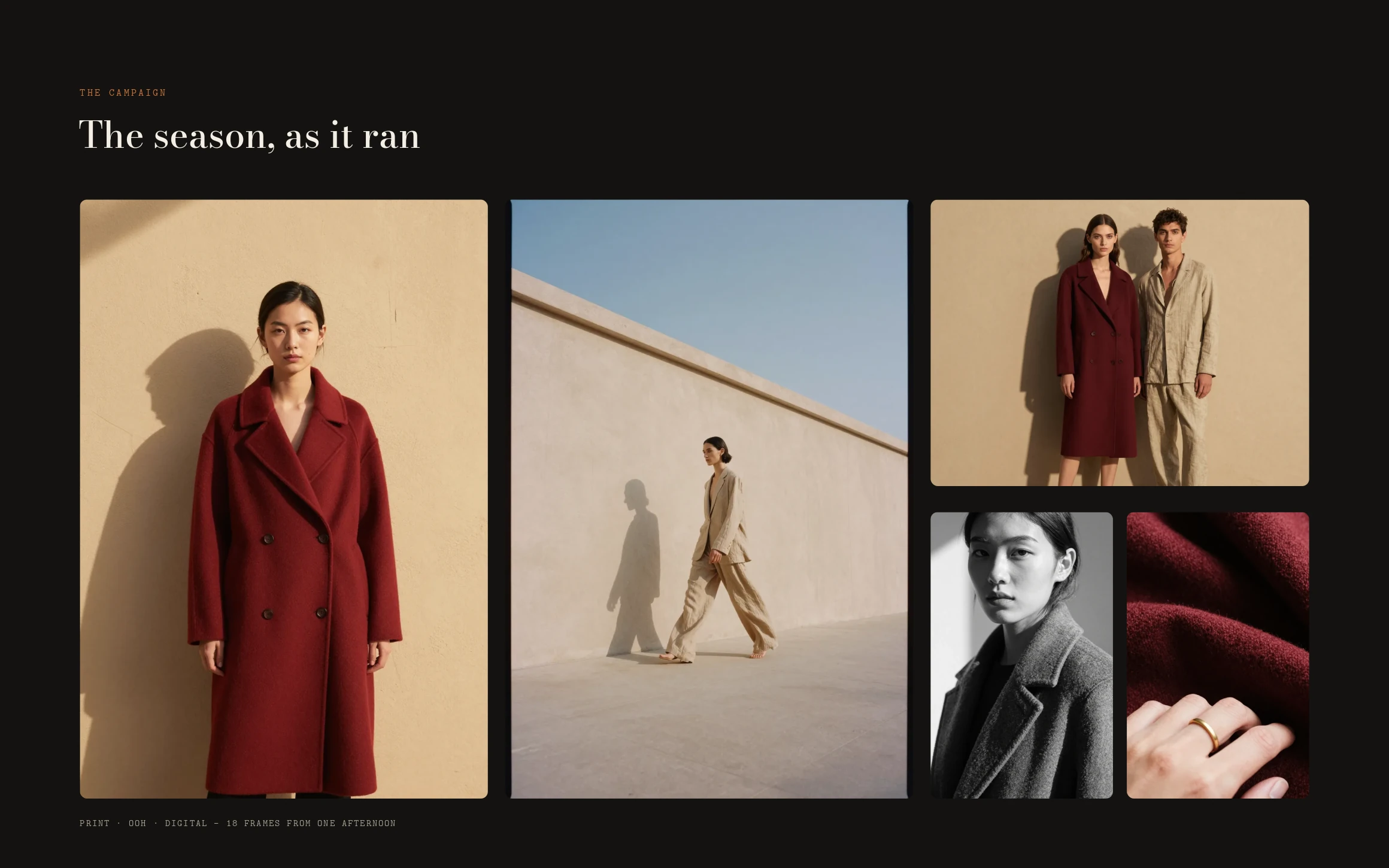
Ánima is a fashion label, and this is the art direction for its seasonal campaign. I set the look, cast it, styled it, planned the light and the shot list, and built the grade — eighteen frames shot against one plaster wall in a single afternoon.
The challenge
The label had been shooting the way everyone shoots: white cyc, soft light, clean retouching — and the work looked like everyone else's. The clothes were beautiful and the pictures were invisible. The brief I set: make the photography as distinctive as the tailoring, without a bigger budget.
My strategic thinking
I moved the whole season outdoors, onto a single plaster wall, and let the sun art-direct it. Hard afternoon light turns a coat's silhouette into a graphic and throws a shadow that becomes the second subject. Strip out everything that competes — locations, props, retouching — and the only things left are the cut of the garment and the shadow it casts.
Process
Three rules first: shoot at 3pm or don't shoot; no retouching; one wall for every look. Then casting for stillness, styling down to a single brass ring, a light plan built around a 42-degree sun with a scrim used only to soften — never to kill — and a five-setup shot list where every frame has a job.
The design system
A palette pulled from the clothes rather than chosen for them — oxblood, sand, clay, bone, ink. A casting brief of faces that hold stillness: the clothes move, the person doesn't. And one LUT for the entire season: warm the mids, hold the highlights, stop the shadow going blue, and never push the oxblood — if the red needs saturating, the light was wrong on the day.
The final solution
Eighteen frames from one afternoon, running across print, out-of-home and digital — a hero, a full-length walk, a fabric detail, a pair against the wall, and a black-and-white portrait. Same wall, same sun, five setups. The season reads as one photograph taken many times.
Results
A campaign that finally looks like the clothes: restrained, tactile, and unmistakably this label. Because the whole season grades in a single pass, the imagery can't drift as it rolls out across channels — and the next season starts from a look, not a blank page.
Lessons learned
Art direction is mostly saying no. The picture gets stronger with every element you remove — the second light, the location, the retouch, the smile. Find the one idea that carries the frame, then defend it against everything that wants to soften it.
Next case study
The Last Hour →