Selected Work / Sound Leaves a Trace
Sound Leaves a Trace
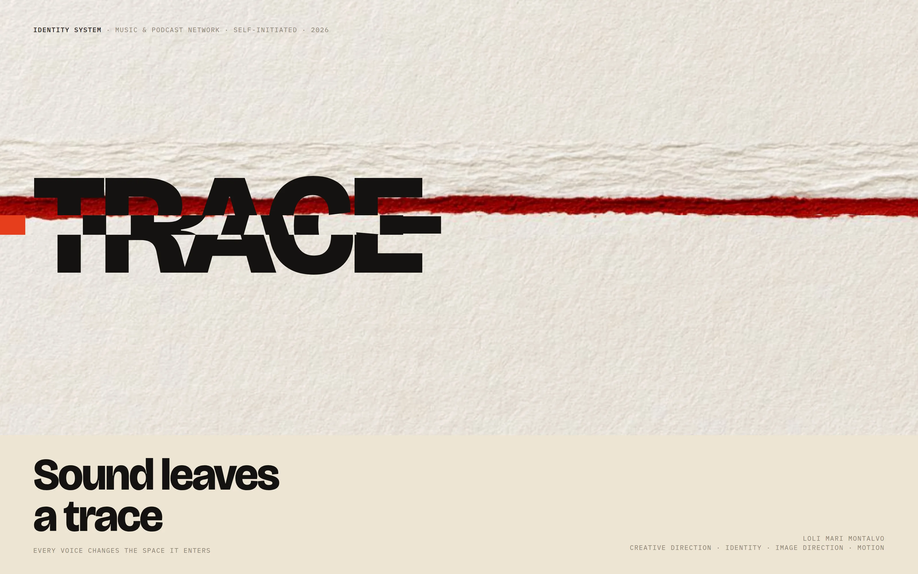
An identity for a music & podcast network that stops drawing sound and starts photographing what it leaves behind — one seam, four materials, every surface.
Trace, a music & podcast network — self-initiated · Brand identity system · 2026
Role
Creative direction, brand identity, image direction, motion
Scope
Strategy, identity, photographic direction, type & colour, motion, guidelines
Outcome
One physical law a producer can extend without a designer
Four material impressions, one studio
The seam — position, proportion, behaviour
The mark, the type scale, the palette
Four covers, one continuous line
The seam cuts the headline
Phone screen to festival wall
Overview
Sound Leaves a Trace is a self-initiated identity system for Trace, a music and podcast network with four very different shows under one roof. I built the whole thing: the strategy, the mark, the photographic language, the type and colour system, the motion vocabulary, and the rules that let a producer add a fifth show without a designer in the room. The premise is one sentence — every voice changes the space it enters — and every other decision in the system is a consequence of it.
The challenge
Every audio brand draws sound the same way. Waveforms, equalizer bars, rings of pulses: accurate, instantly legible, and completely interchangeable — the picture belongs to the category, not to the client. Underneath that sits the real problem of a network. It is not one brand but many voices that still need to feel like one place, and a static mark either flattens the shows into sameness or gets thrown away the moment a producer wants their programme to feel like itself. I set two constraints before drawing anything: no pictures of sound, and no new logo per show.
My strategic thinking
I stopped illustrating sound and started keeping the evidence of it. Listening is physical — air moves, surfaces answer, and something is left behind after the sound has gone. So the identity photographs the aftermath: the crease a voice presses into paper, the pigment a bass note shakes loose, the crack a room remembers. That gave me imagery nobody else in the category owns. What it still needed was one recurring event rather than one recurring shape, and that became the seam: a narrow horizontal interruption at a fixed height that slides the material forward and leaves the signal colour in the gap behind it. A rule, not an artifact — which is exactly why it survives from a favicon to forty metres of LED.
Process
I wrote the physical law first — top edge at 3/8 of whatever it crosses, thickness (1 + A) / 24, displacement 3A seam-heights, always forward — and built it as a live component so I could feel the parameter before committing to it. Then the studio: one description of a table, a light and a camera, and fourteen shots that describe the same fact in different materials. Fifty-six frames came back; eighteen were kept, cropped so the physical band lands at 3/8, and the seam, the type and the mark were applied in layout afterwards. The mark came last on purpose. It had to be a consequence of the rule, not a decoration on top of it.
The design system
One expressive voice and three quiet ones: Bricolage Grotesque set oversized and tight for the wordmark and headlines, Newsreader for editorial, Instrument Sans for interface, and IBM Plex Mono for the technical annotations that sit at the edges like a contact sheet. Bone and carbon are the two grounds; vermilion is the only signal and appears almost exclusively as the trace — the gap the displaced material leaves behind. Oxidized violet and mineral green differentiate two shows and are mixed into the material rather than painted over it. The mark, the Trace, is the seam frozen in a disc on a 24-unit grid: over-driven so it still reads at 16 px, one colour, and never the place for expressive imagery.
The final solution
Four shows on one table. Jazz Hours in displaced pigment, The Newsroom in compressed newsprint, Late Static in ghosted vellum, Bass Theory in a stretched black membrane — each with its own amplitude, edge and tint, all photographed in the same upper-left light. Because the seam sits at the same height on every cover, a row of Trace shows in a subscription list stops being four pictures and becomes one drawing. The same three moves run from an A0 poster to a mobile player whose scrubber is the trace, three social ratios cropped to one cut height, and a festival wall where the trace is a metre-tall band of vermilion.
Results
The test I set was whether the network stays nameable with the logo covered, and it does — on six properties, all of them rules rather than assets: the line at 3/8, displacement that always travels forward, vermilion that only ever appears where something moved, one studio and one light, layouts that are oversized, cropped and annotated, and a motion vocabulary of exactly three verbs. Adding a show means choosing a material and a number. Nothing in the system is designed twice, which is what lets a producer extend it without a designer in the room.
Lessons learned
The strongest identities are physical laws, not pictures. One sentence — sound displaces what it touches — was small enough to fit in a favicon and strict enough to survive a festival wall, and it made every downstream decision easy: where the camera goes, how big the type is, where colour is allowed to appear. The second lesson was about honesty. Everything that moves in this study runs on a hand-scripted envelope, and it is labelled simulated throughout; only output of the analysis pipeline earns the words audio-driven. A system that overstates itself is a system nobody can hand to somebody else.
Next case study
Three Laws →