Selected Work / Northline
Northline
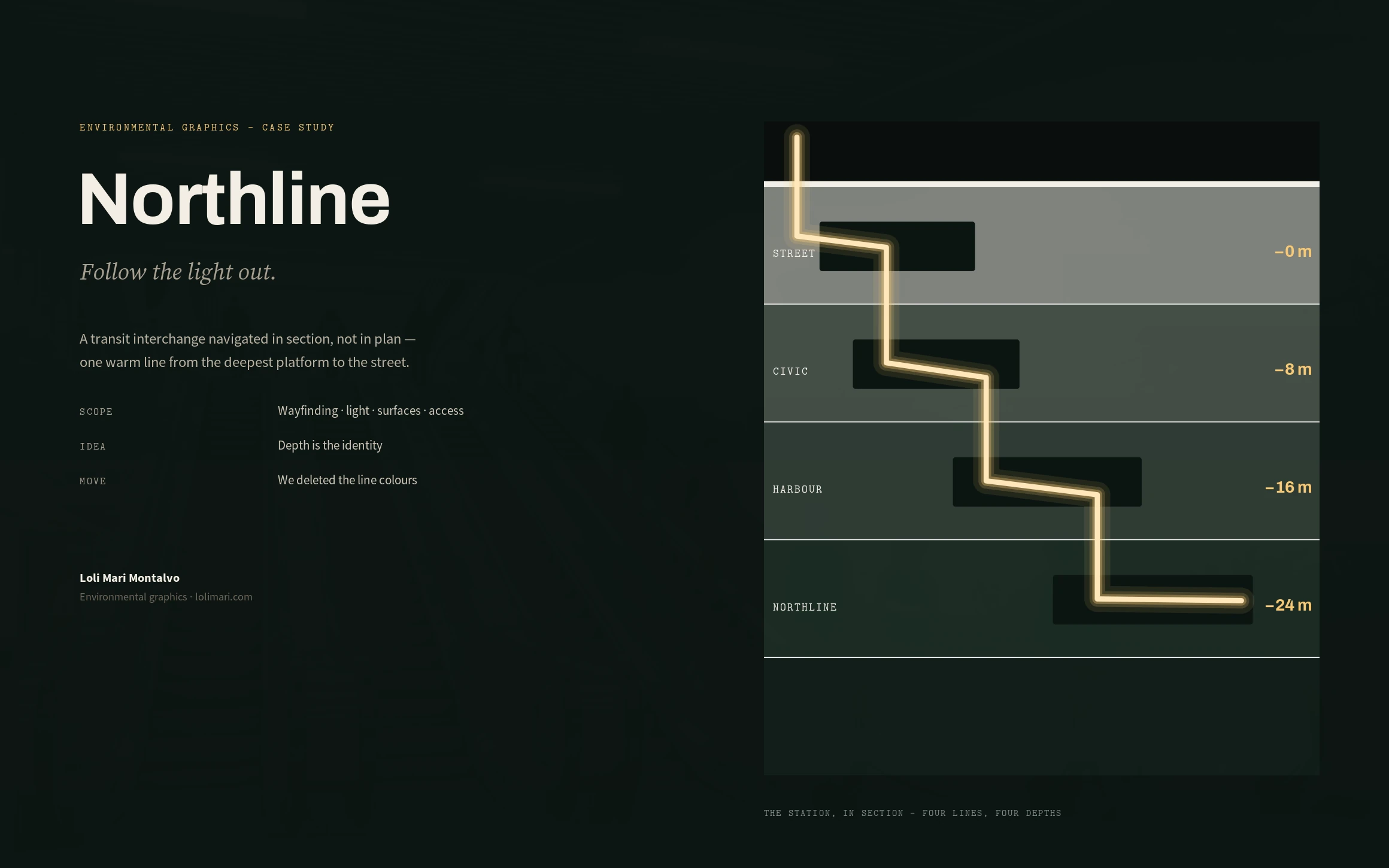
A transit interchange navigated in section, not in plan — one warm line running from the deepest platform to the street.
Northline, a transit interchange · Environmental graphics · 2026
Role
Environmental Graphics & Wayfinding
Scope
Wayfinding, light, surfaces, access
Outcome
Depth became the identity — and the line colours were deleted
Overview
Northline is a deep transit interchange where four lines stack on top of each other. I designed its environmental graphics around a single idea: the station should be navigated in section, not in plan. That produced a continuous line of warm light, a colour system where colour means altitude, and a map that is a cutaway rather than a floorplan.
The challenge
An interchange is where wayfinding fails, and the standard fix — colour-coded lines, arrows, more signs — was already in place and already not working. I had to find out why people were still getting lost before I designed a single panel.
My strategic thinking
I followed forty travellers through the station. They almost never hesitated at a corner. They hesitated at every change of level: 74% paused at the mid-level transfer, 61% at the top of an escalator, against 8% at a corridor junction. Nobody gets lost in plan. They get lost in section — and no wayfinding system on earth tells you how deep you are, or whether the street is up or down from here. Then the second realisation: four lines meet here, and each one sits at a different depth. The station had already labelled itself, in metres. So I deleted the colour-coded line system — it was inventing a second, arbitrary language on top of one the building was already speaking.
Process
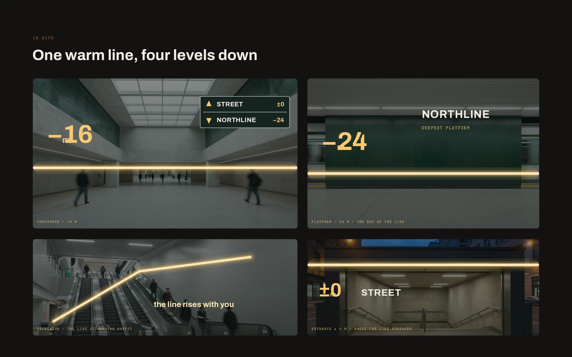
From the observation study I rebuilt the whole system around elevation. Surfaces were keyed to depth, so colour reads as altitude before a word is read. The four lines were re-identified by the level they sit on. The station map was redrawn as a section. And every sign was cut back to two facts: an arrow, and a number in metres.
The design system
The Daylight Line: one continuous warm channel, 1.9 km, unbroken and unbranched, running from the deepest platform up to the street. It is the only warm light in the station — everything else is cool and gets colder with depth. It has no branches, so there is no wrong way to follow it, and it sits at 900 mm, hand height, as a recessed channel you can rest your hand in and walk. Above it: a depth palette from bone at street level to near-black at −32 m, architectural numerals at every level, and signs that carry an arrow and a number and nothing else.
The final solution
A station with one instruction: the street is always up the line. Follow the warmth and you surface. The line climbs the escalator soffits with you, runs the length of every platform, and finally breaks daylight at the entrance — the only thing in the building that goes all the way through.
Results
A sign now carries two facts instead of five. The system degrades gracefully in the ways that matter: it works if you can't read the language, because warm means out; it works if you can't see, because the line is a handrail before it is a graphic; and it works in smoke, because the egress route is the thing everyone has been following all day. Accessibility isn't a layer on top of this system — it is the system.
Lessons learned
The best environmental graphics aren't applied to a building — they're found in it. The station was already telling people where they were, in metres of rock above their heads. All I did was stop shouting over it. The most valuable thing I designed here was the four colours I removed.
Next case study
Solstice →