Selected Work / Isla Metro Paint Bar
Isla Metro Paint Bar
A brand and campaign for the city’s paint-and-sip escape.
Isla Metro Paint Bar · Founder & creative direction · live NYC brand
Role
Brand & Creative Direction
Scope
Brand identity, campaign system, social, corporate, out-of-home
Outcome
A three-word system that runs from a story ad to a billboard
Challenge
Isla Metro runs immersive paint-and-sip nights across NYC — public events, date nights, corporate team-building and venue partnerships. Four audiences, one brand, and every channel from Instagram stories to subway posters to fill.
Approach
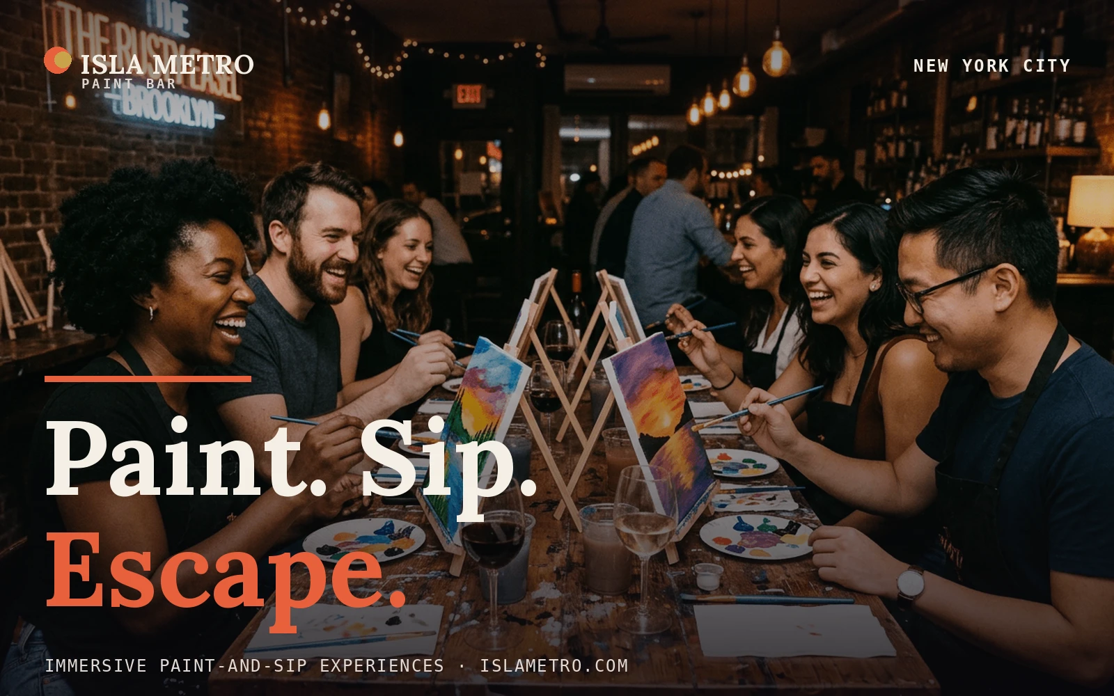
Make the offer the identity. Paint. Sip. Escape. — three beats that structure every asset. A warm editorial system — deep aubergine, a coral signal, brass, a hand-mixed paint-dot mark — frames real event photography so the brand feels like a night out, not a coupon.
Process
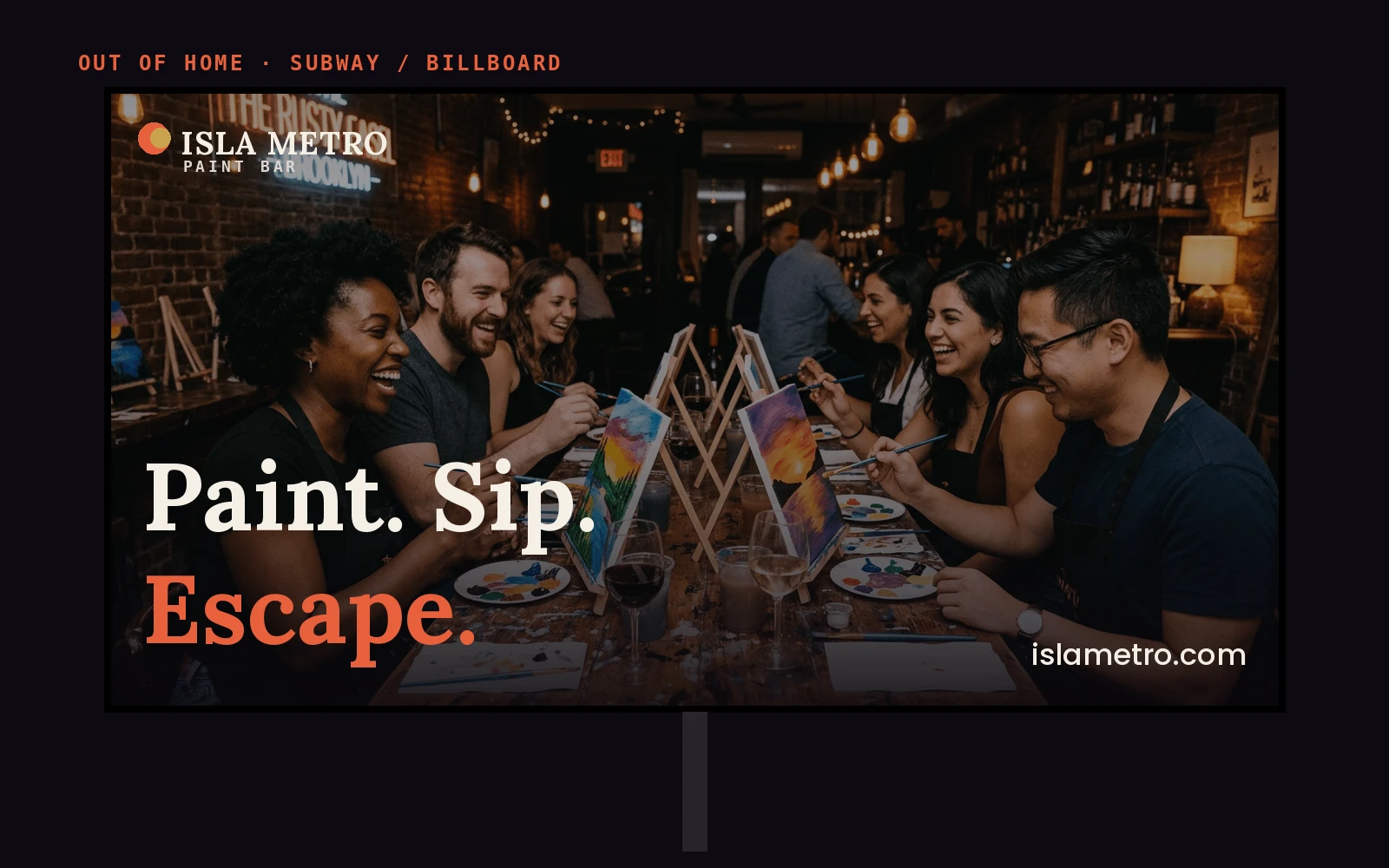
Built a poster system on real photography: serif headlines, a coral rule, mono event details. One template flexes from a $60 rooftop event card to a corporate one-sheet to an out-of-home board without losing the voice.
Creative Direction
Photography leads; type stays out of the way. Every layout ends on the same three-word close and the same coral mark, so a feed post, a venue pitch and a billboard are unmistakably one brand.
Outcome
A campaign world that sells four things at once — public nights, date nights, corporate and venue partnerships — from one kit. Live at islametro.com.
Lessons learned
When the product is an experience, sell the feeling in three words and let real faces carry the rest.
Next case study
Complexity into Clarity →